Clove
Clove is an AI-assisted hiring workspace that brings jobs, candidates, interviews, messages and team decisions into one place. The idea was to make AI feel like part of the product, not a separate chatbot recruiters have to remember to use.
The problem Clove is solving
Hiring teams usually have plenty of information. The problem is finding the right information at the right time. Candidate records, interview notes, scorecards and messages often live in different places, so small delays can easily turn into missed follow-ups or slow decisions.
I wanted Clove to handle that complexity without feeling heavy. Each page brings the next useful action forward, while keeping the details close enough for the team to make a confident decision.
Overview: starting with what needs attention
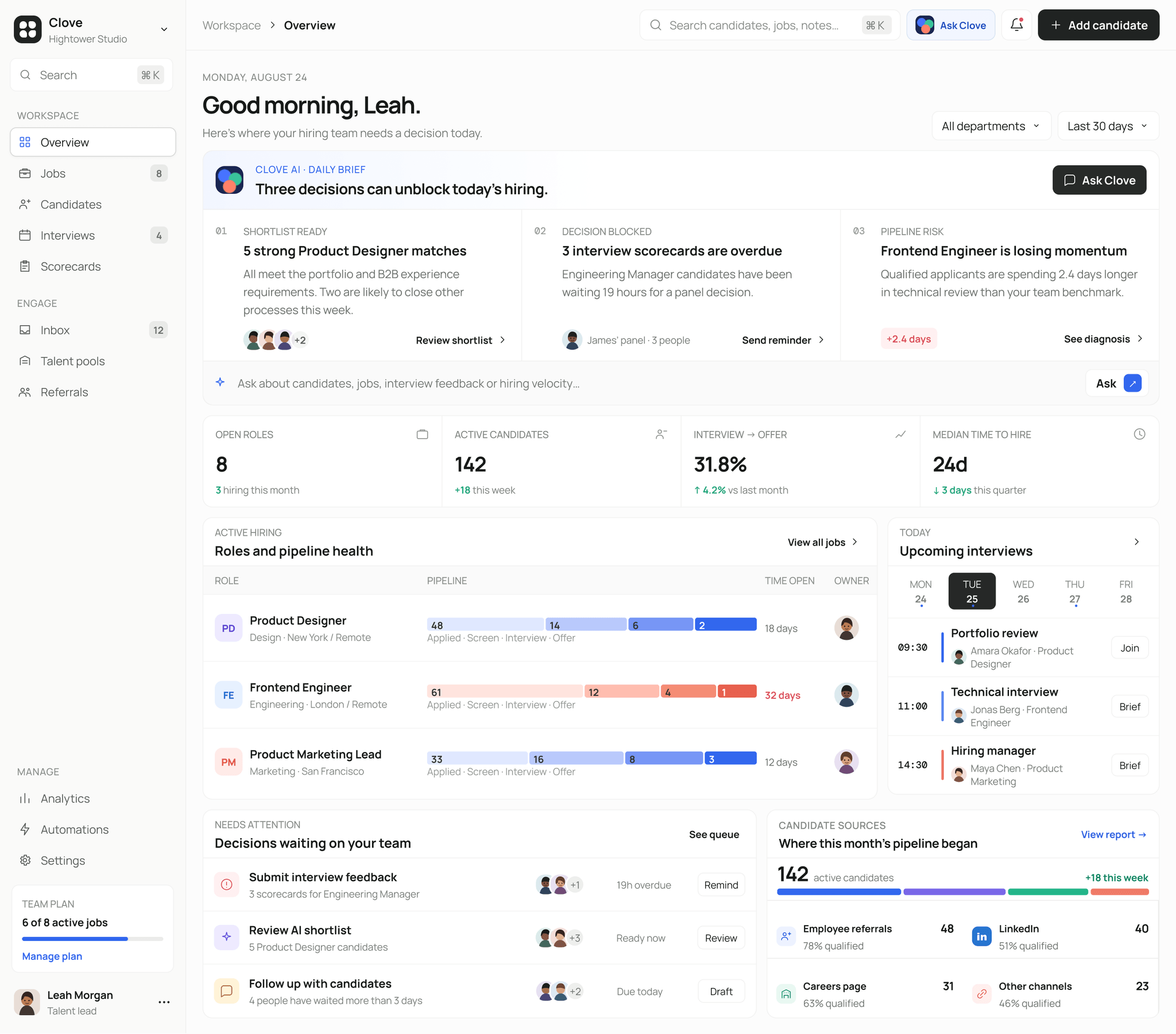
The overview answers the questions a hiring lead is likely to have at the start of the day. What is blocked? Which candidates need attention? Where is the pipeline slowing down? The daily brief turns those signals into three clear decisions before showing the wider hiring picture.
I chose this approach because a list of metrics alone would not be very helpful. Clove starts with what the team can act on, then provides the numbers and activity behind it.
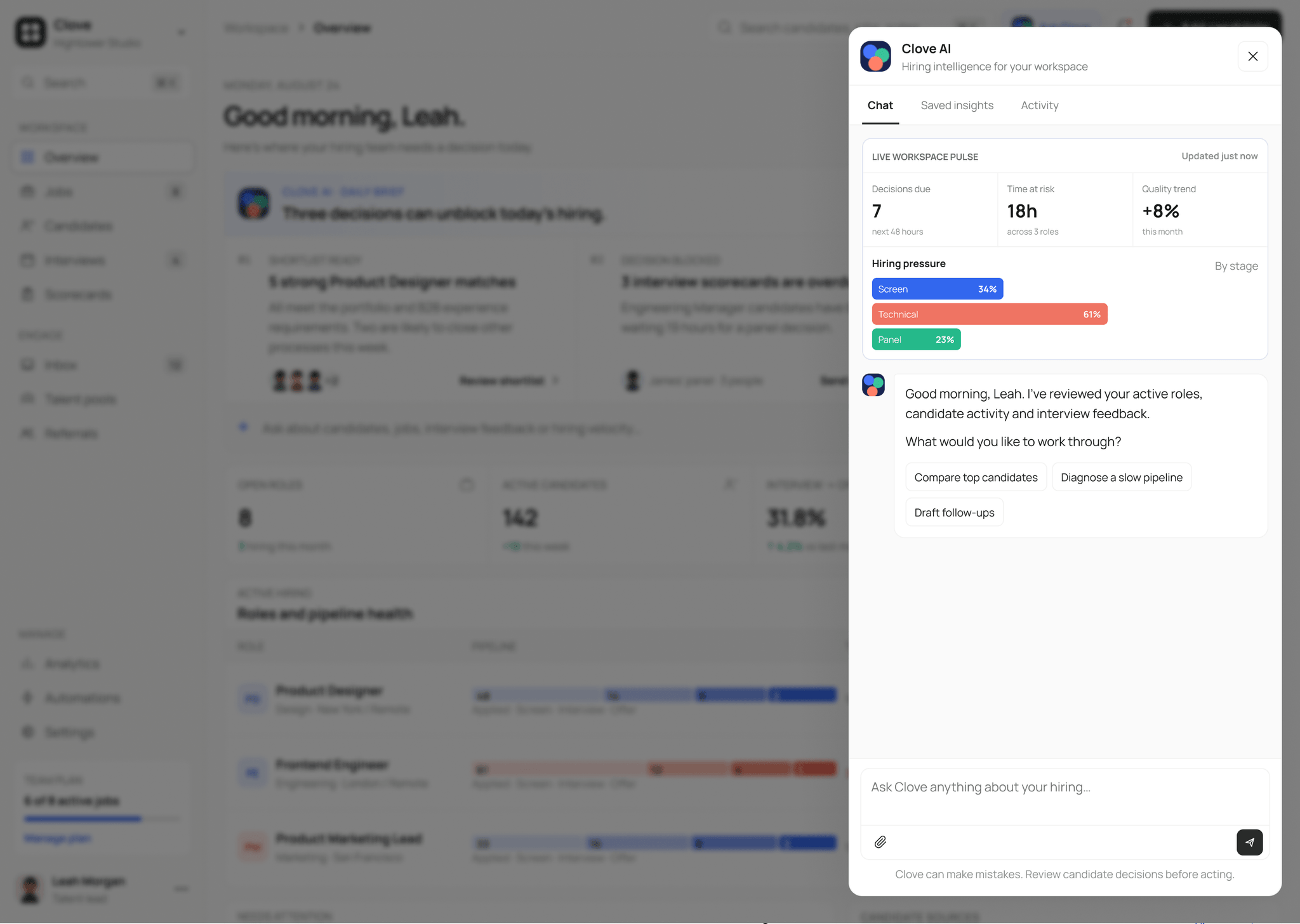
Clove AI: useful context before the first question
Clove AI opens in a side panel, so recruiters can ask a question without leaving the page they are working on. It begins with a quick workspace pulse showing decisions due, time at risk and pressure across hiring stages.
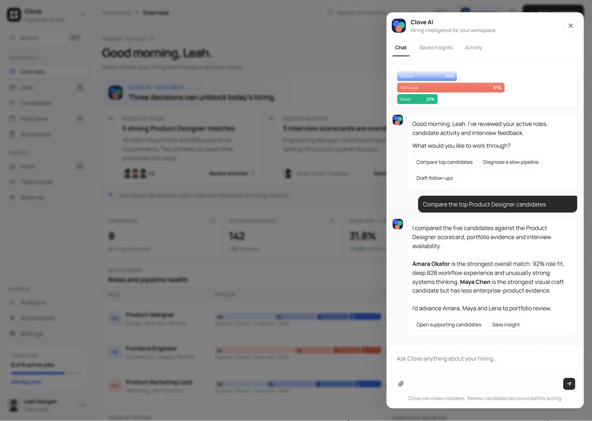
When a recruiter asks Clove to compare candidates, the answer stays short and practical. It uses scorecards, portfolio evidence and interview availability, explains the trade-off, and keeps the supporting candidate records close by.
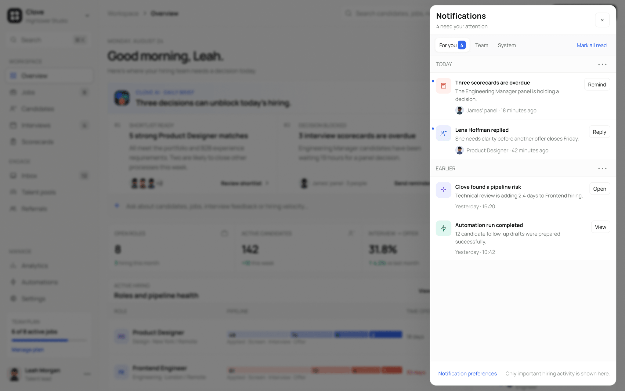
Notifications use the same idea. Overdue feedback, candidate replies, pipeline risks and completed automations are grouped by urgency, with an action attached to each item.
Jobs: the full role in one workspace
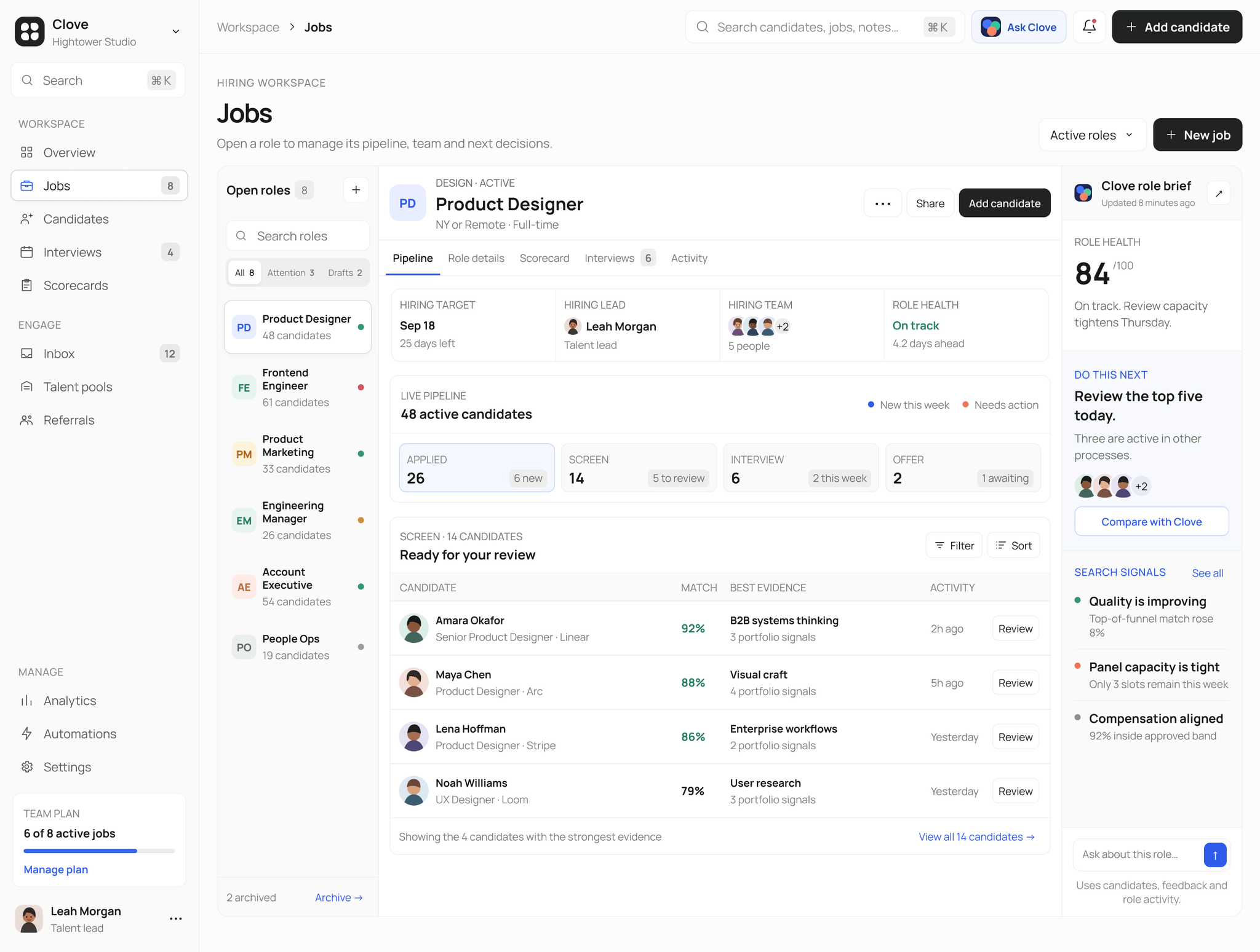
The Jobs page keeps the role list, pipeline stages and candidate review on one screen. A hiring lead can check the health of a role, see where candidates are sitting and review the strongest people without jumping between separate reports.
The panel on the right highlights what the team should do next and the signals behind that suggestion. AI supports the decision, but the candidate table remains the main source of truth.
Candidates: keeping the full story together
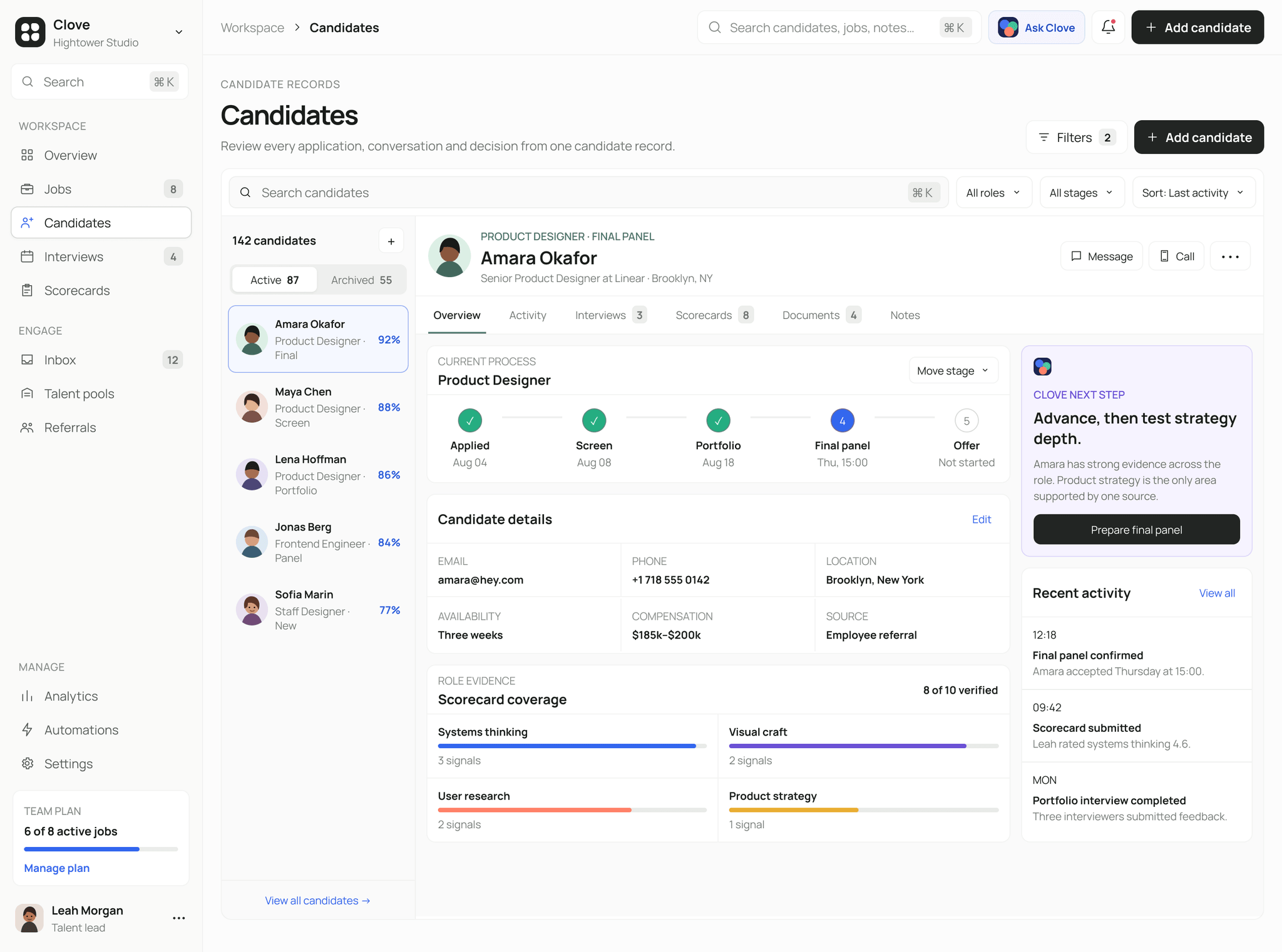
The candidate page brings progress, contact details, scorecard coverage and recent activity together. This makes it easier to understand where someone is in the process without piecing their story together from several tabs.
The next-step card does more than repeat a match score. It points out the area where the team still needs stronger evidence, which gives the next interview a clearer purpose.
Scorecards: seeing alignment early
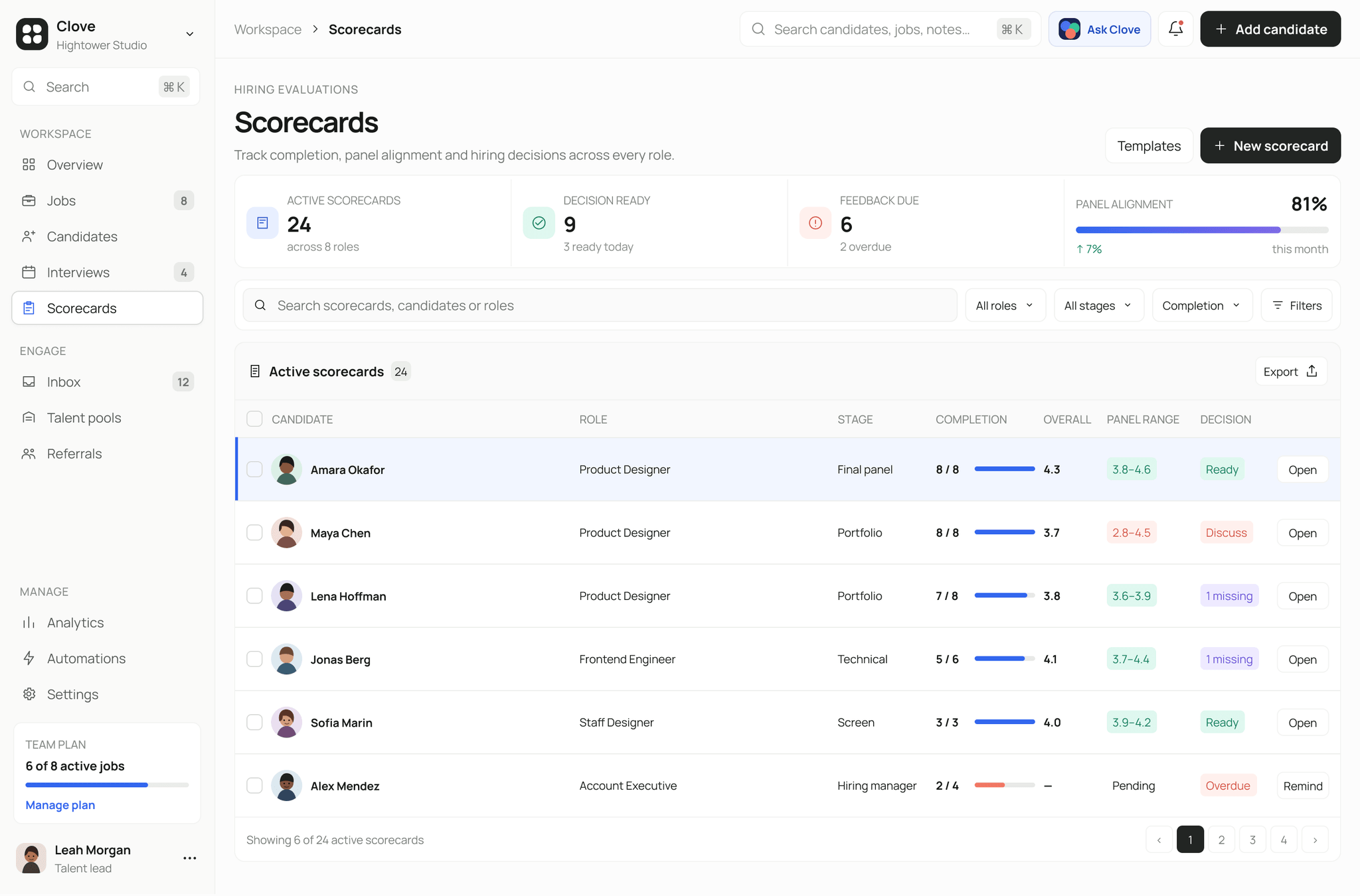
The scorecards page is designed for decisions, not storage. Completion, overall rating, panel range and decision status appear in the same row, so missing feedback and disagreement are easy to spot before a hiring meeting.
I kept the color system simple. Ready, discuss, missing and overdue each have a clear visual signal, while the rest of the table stays quiet enough to scan.
Inbox: messages with hiring context
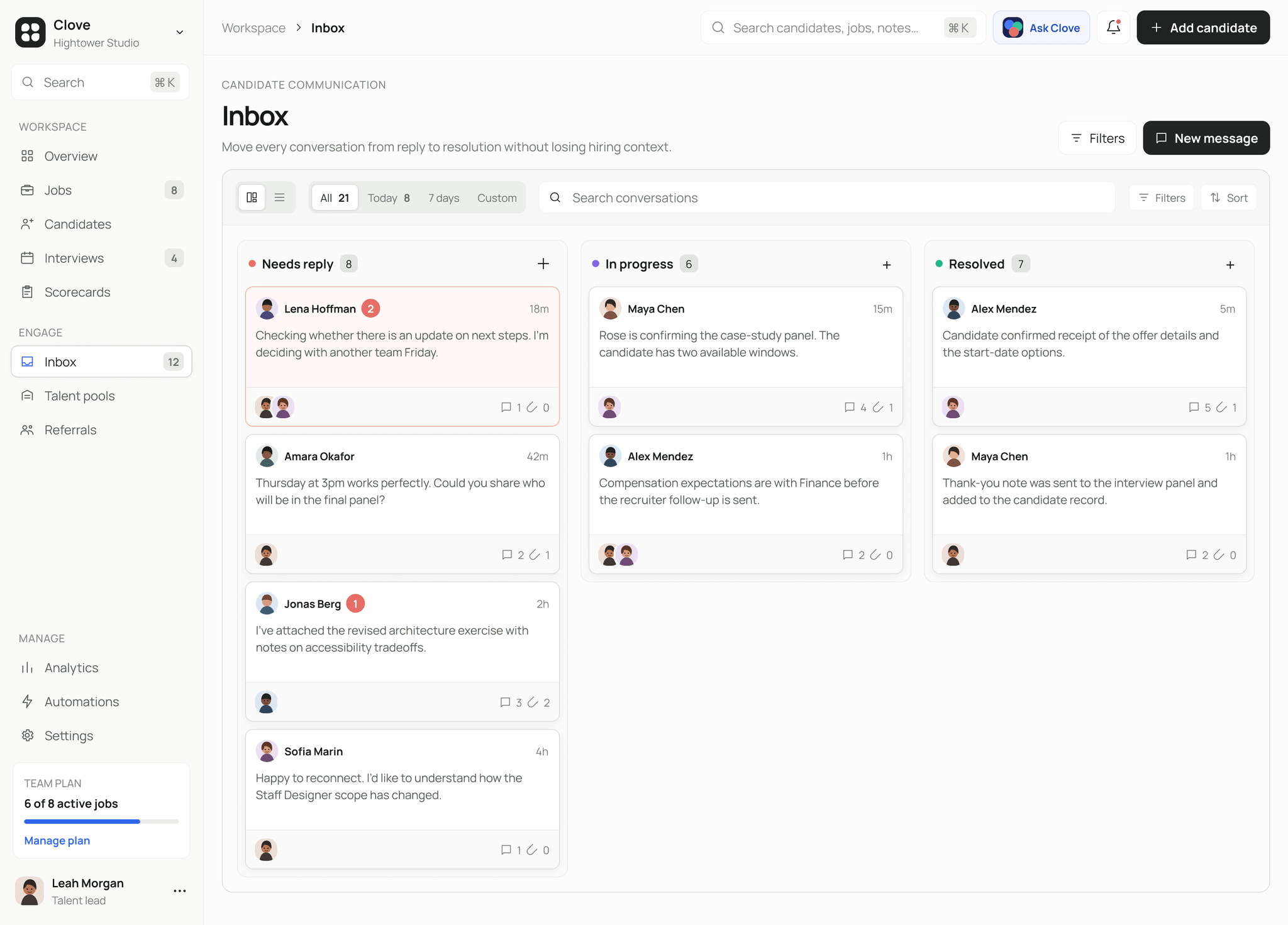
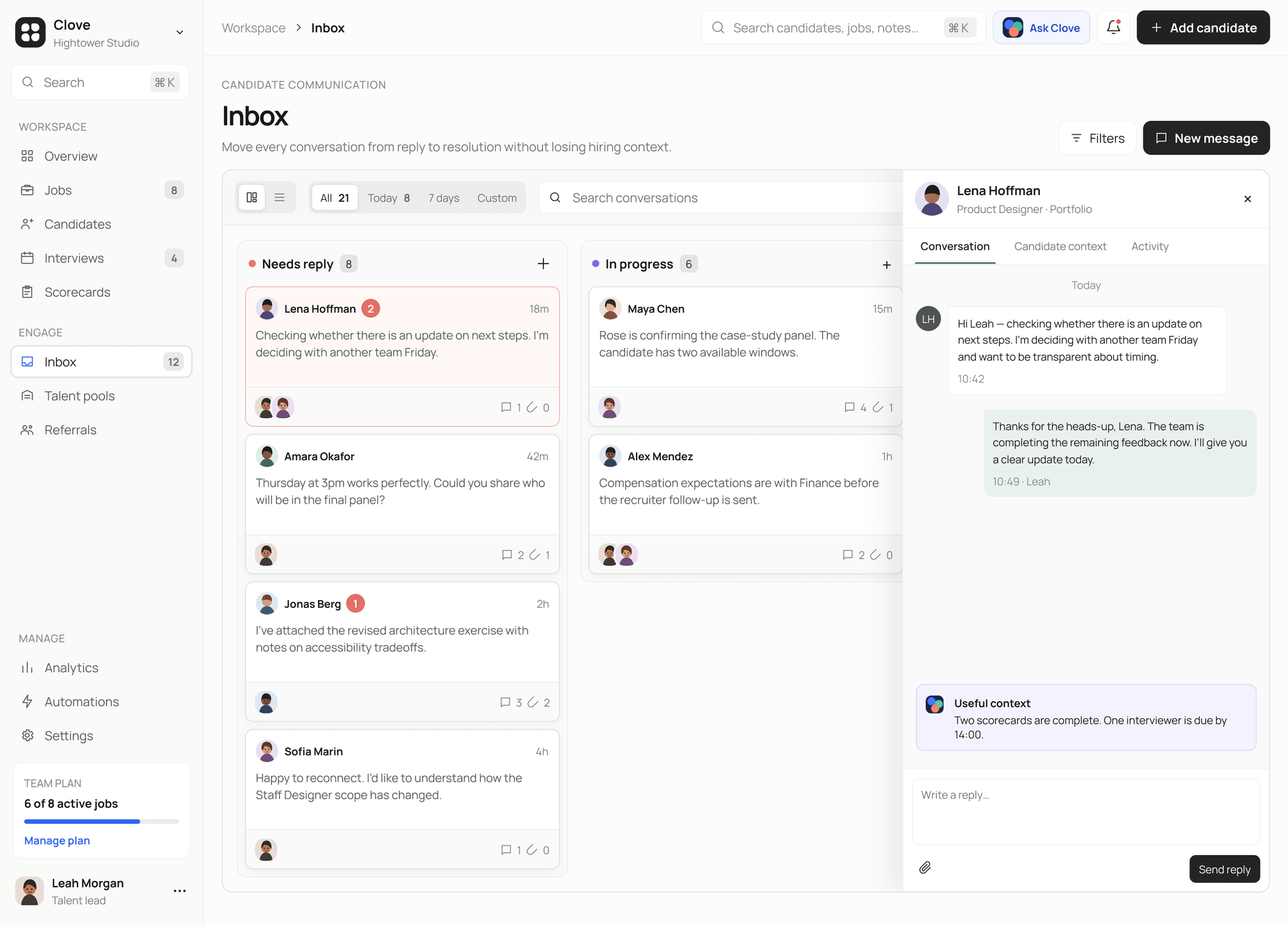
The Inbox uses a board to separate conversations that need a reply, are in progress or have been resolved. This turns candidate communication into a visible workflow instead of one long chronological list.
Opening a message keeps the board in place and brings the conversation into a side panel. Candidate context and a short AI note sit beside the thread, so the recruiter can respond without going back to the candidate profile first.
Talent pools: making past relationships useful
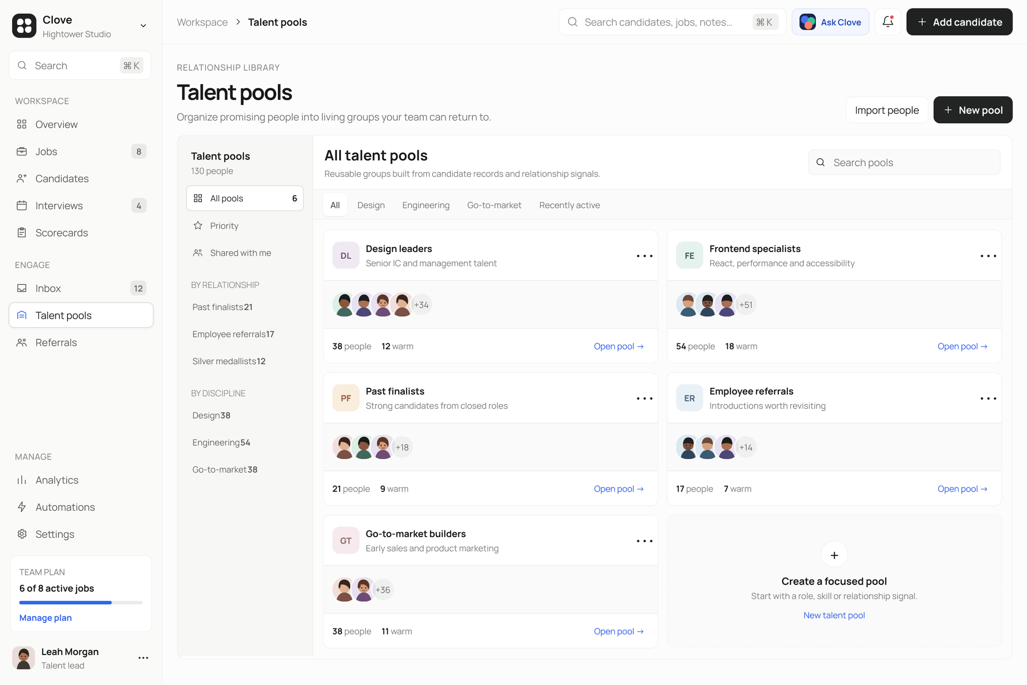
Talent pools help teams organize promising people by discipline and relationship, including past finalists and employee referrals. Warm counts and familiar faces make each pool feel active and reusable, rather than like a folder that will be forgotten.
Referrals: making a trusted channel visible
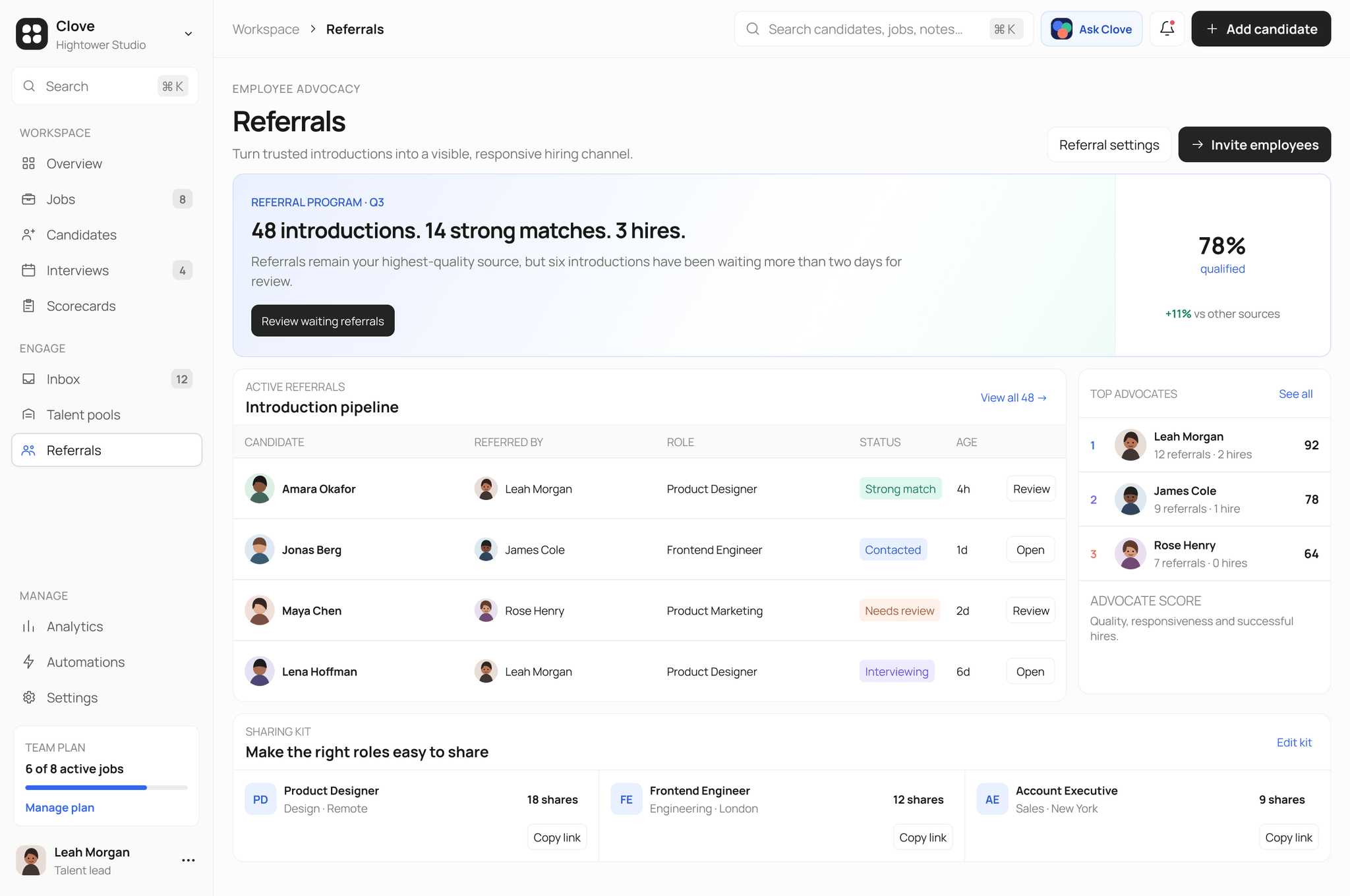
The referrals page connects programme performance with the people behind it. The summary shows introductions, strong matches and hires, while the pipeline makes waiting referrals and review states easy to see.
Top advocates and shareable role kits support the behaviour the product wants to grow: trusted introductions that can be followed up, measured and acknowledged.
Analytics: showing what the numbers mean
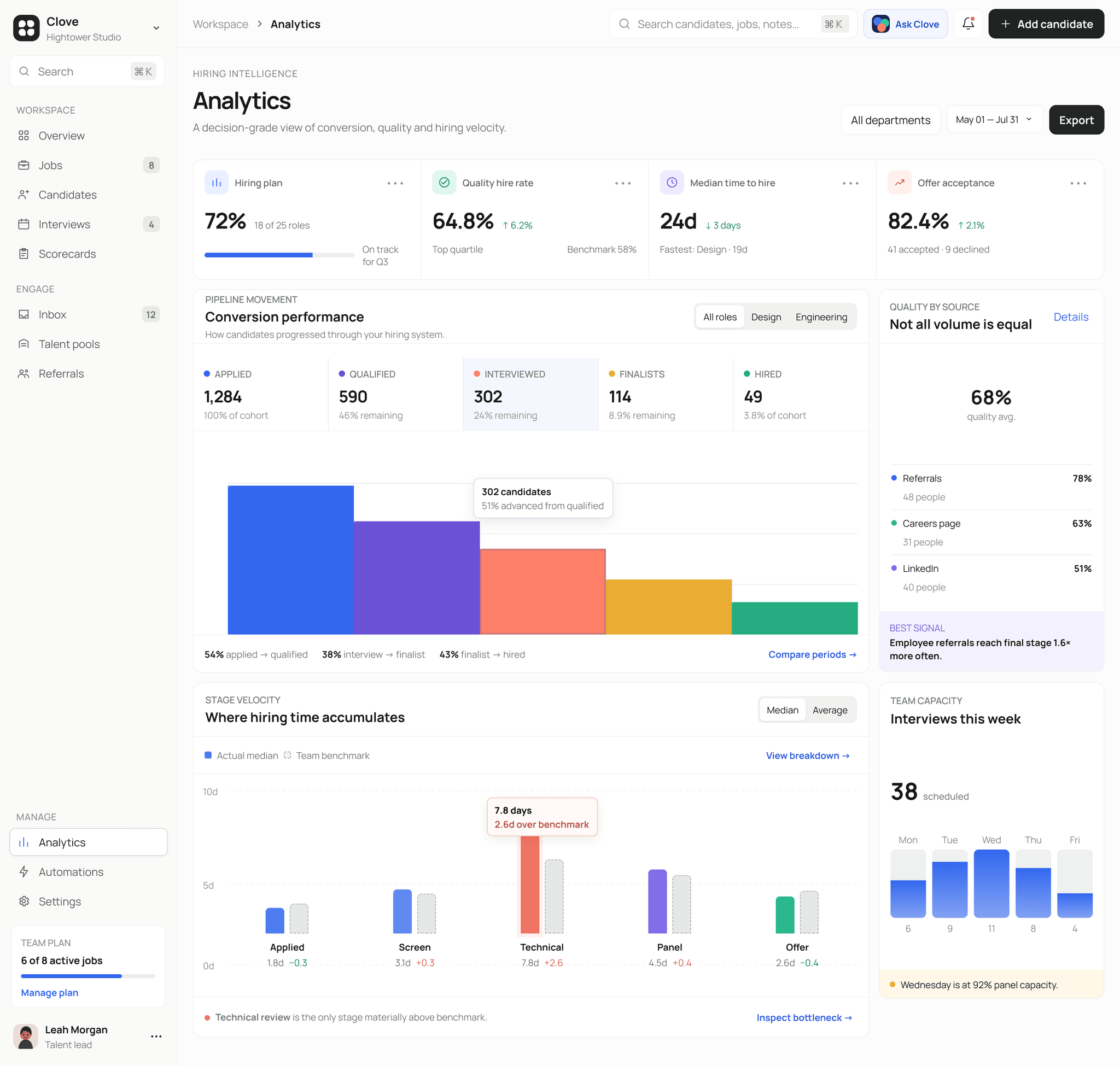
The analytics page moves from overall hiring health into conversion, source quality, stage speed and team capacity. Each chart includes a takeaway or comparison, so the user does not have to interpret every number from scratch.
Volume and quality are kept separate on purpose. A source can bring fewer candidates and still produce stronger hires, which is why referral quality gets its own space beside the conversion funnel.
Automations: saving time without losing control
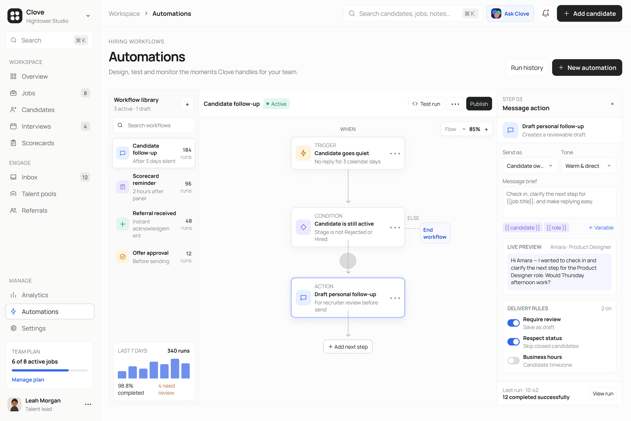
The automation builder shows triggers, conditions and actions as a simple visual flow. When a step is selected, its settings open beside the workflow with a live message preview and delivery rules.
This lets teams automate follow-ups while still choosing when a message needs review, when a candidate should be skipped and which safeguards should stay on.
Integrations: connecting the tools teams already use
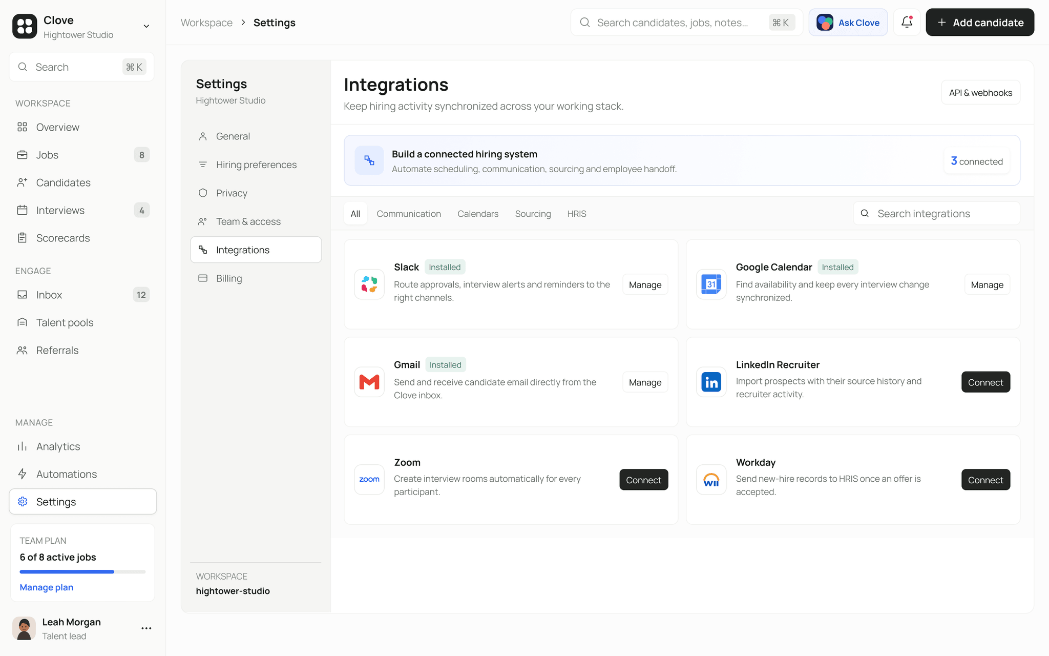
Integrations are grouped by what they help with, such as communication, calendars, sourcing and HR systems. Installed and available tools are easy to tell apart, and the summary at the top explains how the connected tools support the wider hiring workflow.
What this project demonstrates
Clove was an exercise in designing a detailed operational product without making it feel overwhelming. The repeated layout patterns, side panels and clear action states create consistency across very different tasks, from reviewing a candidate to checking a slow pipeline.
The main design decision was to keep every recommendation close to its evidence. Clove can point out what deserves attention, but the hiring team can still see why and make the final call themselves.