Radius
A unified financial command center for global independents
Radius is a modern fintech dashboard built for freelancers and remote professionals who earn, convert, and manage money across borders. Instead of juggling Wise, local banks, crypto wallets, invoicing tools, and spreadsheets, Radius brings everything into one calm, cohesive experience designed to reduce friction and restore clarity.
The Problem
Remote work removed geography, but financial tools didn’t catch up. A designer in Lagos bills clients in New York, a developer in Nairobi receives USDT, and a strategist in Accra invoices a London agency in GBP. Their income is global, but their financial infrastructure is fragmented.
Money lives everywhere: USD in one app, NGN in another, crypto in a separate wallet, and invoices buried inside Google Docs. To answer a simple question — “How much do I actually have?” — users manually stitch balances together across platforms. The experience is fragmented, cognitively expensive, and unnecessarily stressful.
Most fintech dashboards don’t help. They overwhelm users with dense tables, harsh layouts, and finance-first thinking that assumes expertise. Instead of reducing anxiety, they amplify it. The opportunity became clear: what if one platform could handle earning, converting, saving, spending, and tracking — without ever feeling heavy or intimidating?
Who It’s For
Radius is designed for global independent professionals who operate across currencies and borders. They typically earn in two to four currencies simultaneously, convert funds regularly, require professional invoicing, and save in both fiat and crypto. They are financially aware but not finance professionals, and they value clarity and speed over feature bloat.
This product is not built for institutional traders or banking analysts. It is built for capable professionals who simply want control and confidence over their financial world without needing five different tools to achieve it.
Design Philosophy
Three principles guided the system.
1. Clarity Over Density
Financial dashboards often attempt to surface every possible data point at once. Radius takes a different approach by layering information deliberately. High-level portfolio summaries appear first, with deeper details revealed progressively. Users are never confronted with unnecessary complexity upfront, yet the depth of data remains available when required. The interface stays calm even when the underlying financial data is not.
2. Action Lives Next to Data
If a user sees their USD balance, they can deposit or withdraw immediately. If they view exchange rates, they can swap currencies in one click. The system minimizes the distance between intent and execution, removing unnecessary navigation and reducing friction at every step.
3. One Mental Model
Fiat wallets and crypto wallets follow the same structural pattern: identical layouts, hierarchy, and action placement. While the content differs — account numbers versus wallet addresses — the interaction model remains consistent. This dramatically reduces the learning curve, particularly for users who are newer to crypto but already familiar with traditional banking interfaces.
The Experience
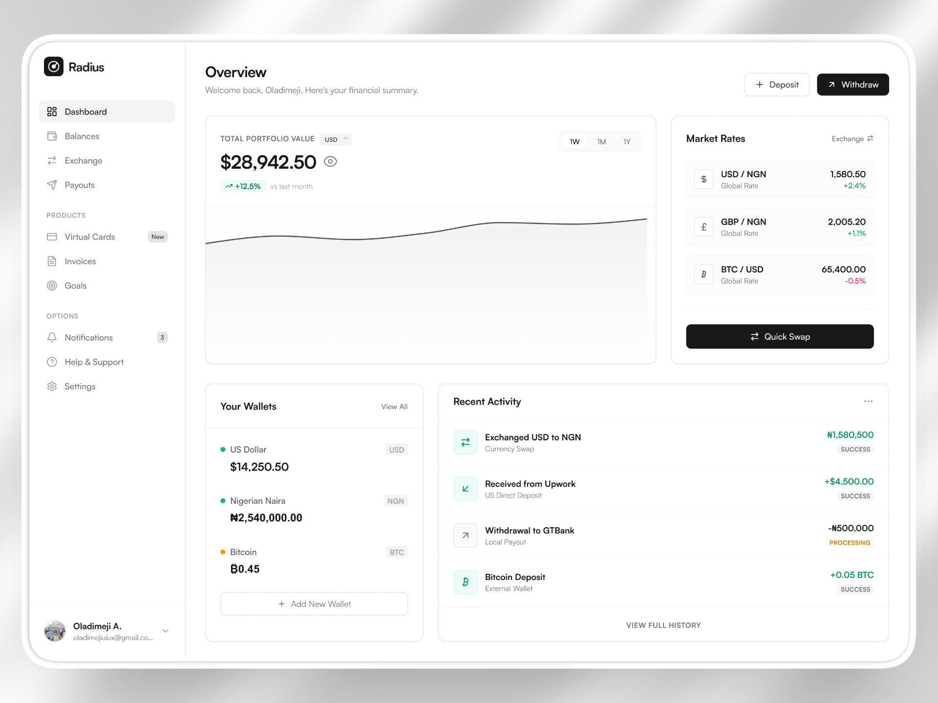
Dashboard — Your Financial Position at a Glance
The dashboard is designed to answer the first and most important question: Where do I stand? It aggregates fiat and crypto holdings into a unified portfolio value that can be toggled between USD, NGN, EUR, GBP, and BTC. Values recalculate in real time, eliminating mental currency conversions.
Trend indicators transform static balances into trajectories, helping users understand momentum rather than just totals. Live market rates are positioned alongside a Quick Swap action, enabling informed decisions without context switching. The dashboard is not a feature list — it functions as a financial cockpit.
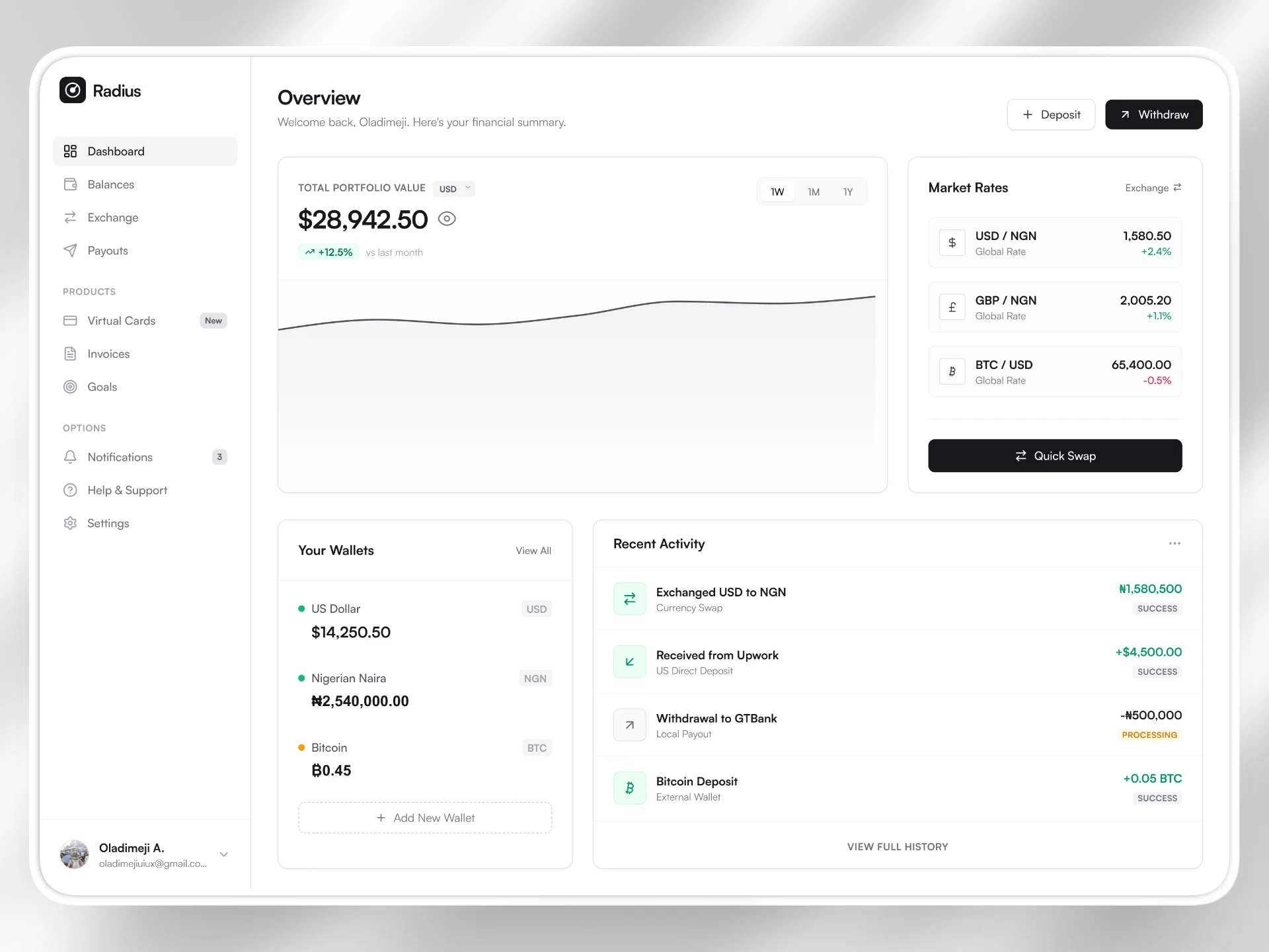
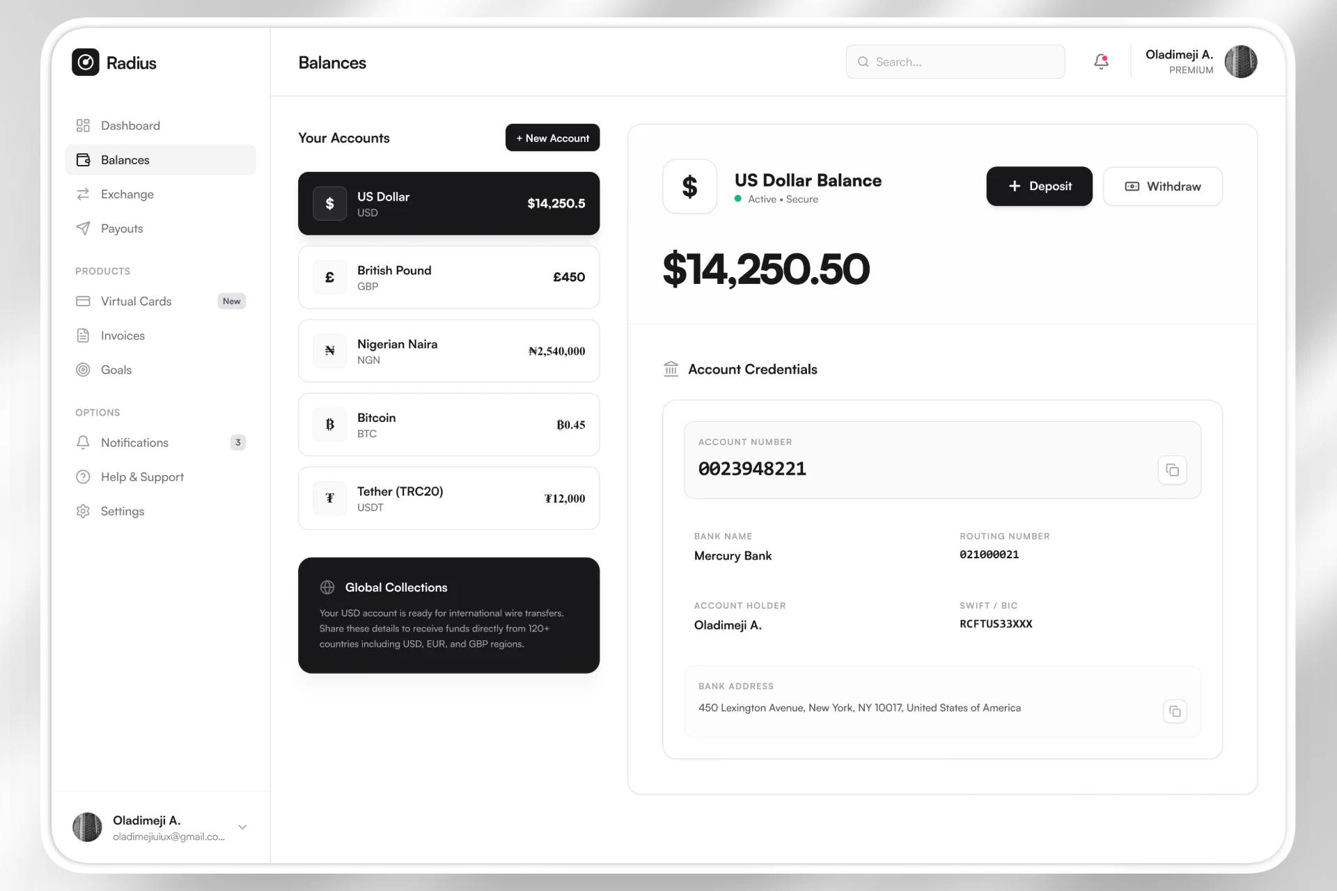
Wallets — Structured, Predictable, Shareable
The wallets section uses a master-detail layout that keeps navigation intuitive. Every wallet prominently displays its balance, includes easily copyable credentials, and surfaces contextual actions. This structure remains consistent across fiat and crypto accounts, reinforcing familiarity.
Crypto wallets include a highly visible warning banner reminding users to send only the correct asset type. In crypto environments, mistakes are irreversible. The design accounts for this reality and prioritizes preventative clarity over minimalism.
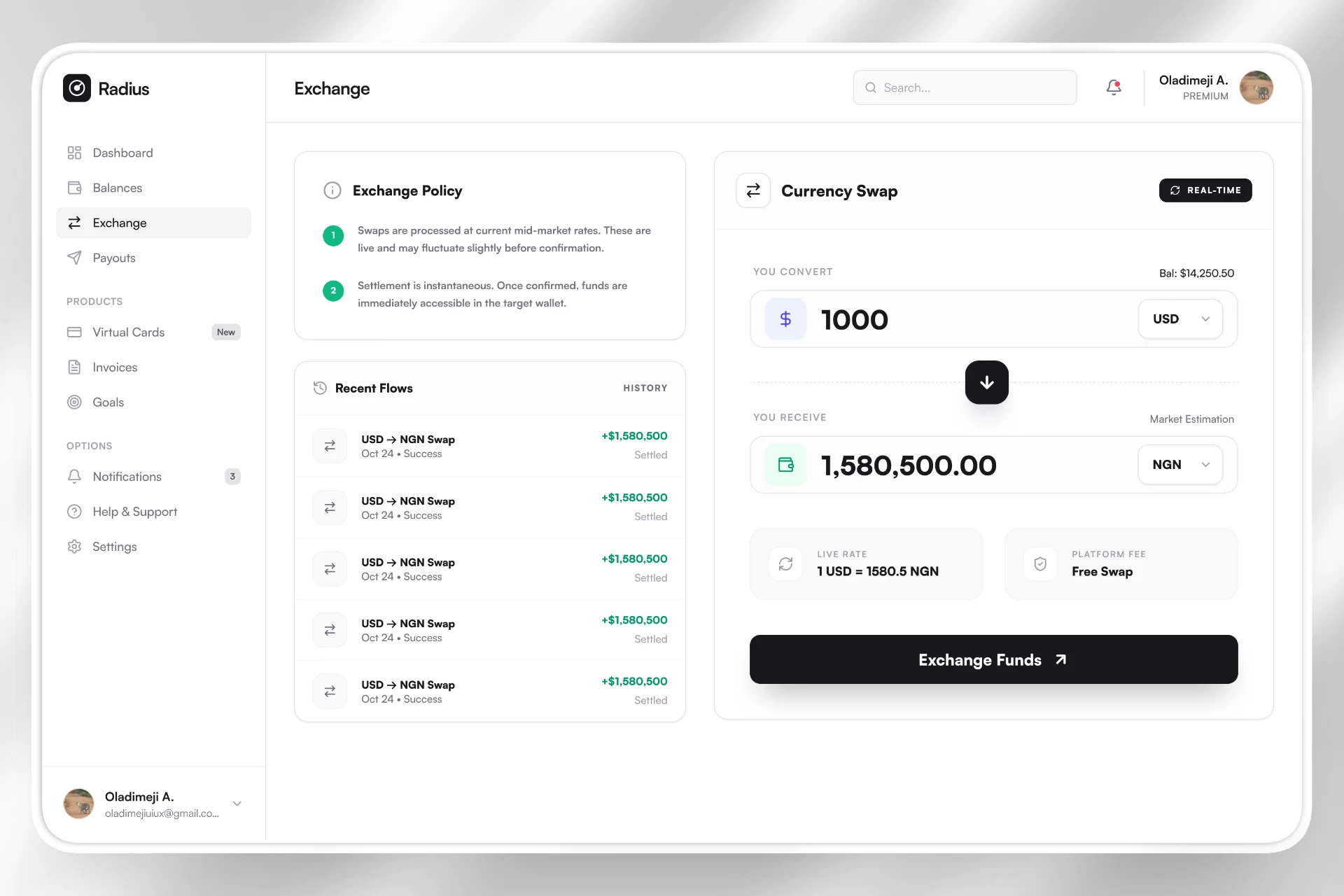
Exchange — Designed for Confidence
Currency exchange is both high frequency and high trust. The interface uses large, readable input fields to ensure amounts are verified at a glance before confirmation. Currency pairs can be reversed instantly, and fee transparency is surfaced clearly to eliminate ambiguity.
The goal is not just speed, but reassurance. Every interaction reinforces that the user understands exactly what will happen before funds move.
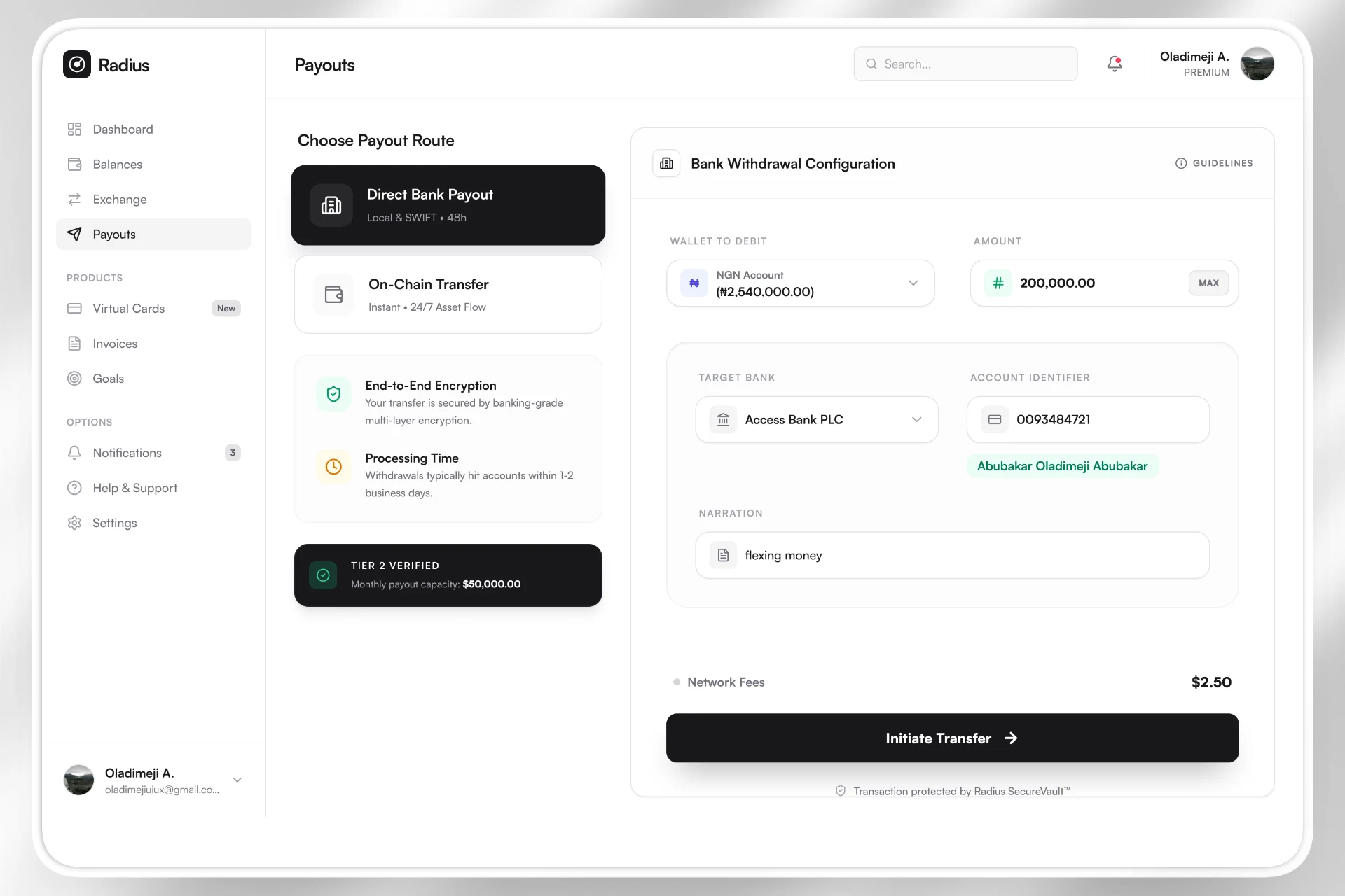
Payouts — Money Out Without Anxiety
When money leaves the platform, trust is tested. Radius treats bank withdrawals and crypto transfers as equally important flows, presented through large, visually distinct route selectors rather than subtle tabs or radio buttons. This reduces the likelihood of costly selection errors.
Form interactions provide clear focus feedback, while verification tiers and embedded security messaging reinforce safety. These signals are integrated directly into the interface rather than hidden behind help documentation.
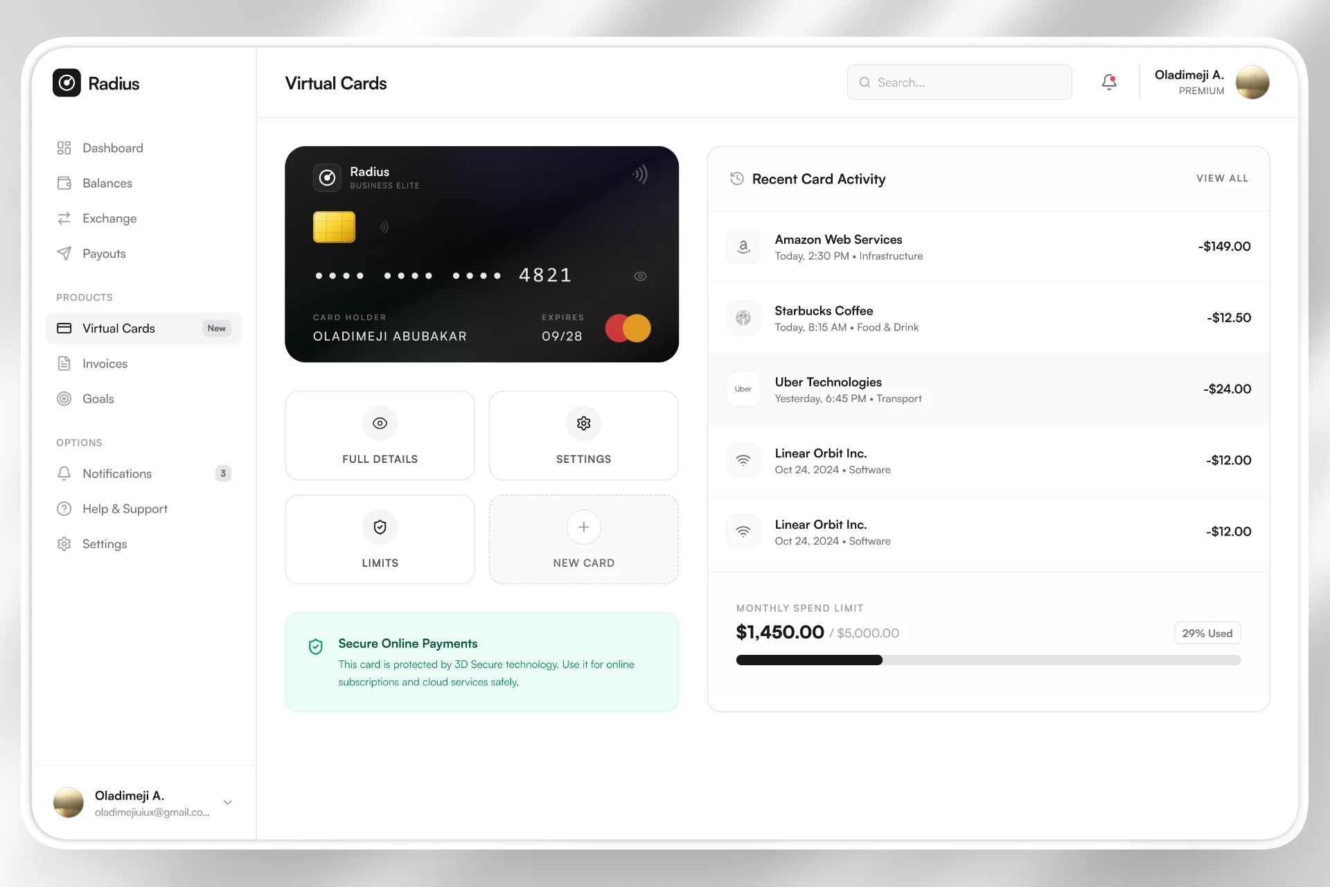
Virtual Cards — Premium, Even Digitally
The virtual card component is intentionally elevated visually. Layered gradients, subtle texture, and realistic chip detailing create immediate recognition. The goal is not skeuomorphism for nostalgia, but for clarity and trust.
When a card is frozen, its visual state transforms through grayscale filtering, reduced opacity, and a prominent status badge. The state is communicated visually before it is read, minimizing cognitive load.
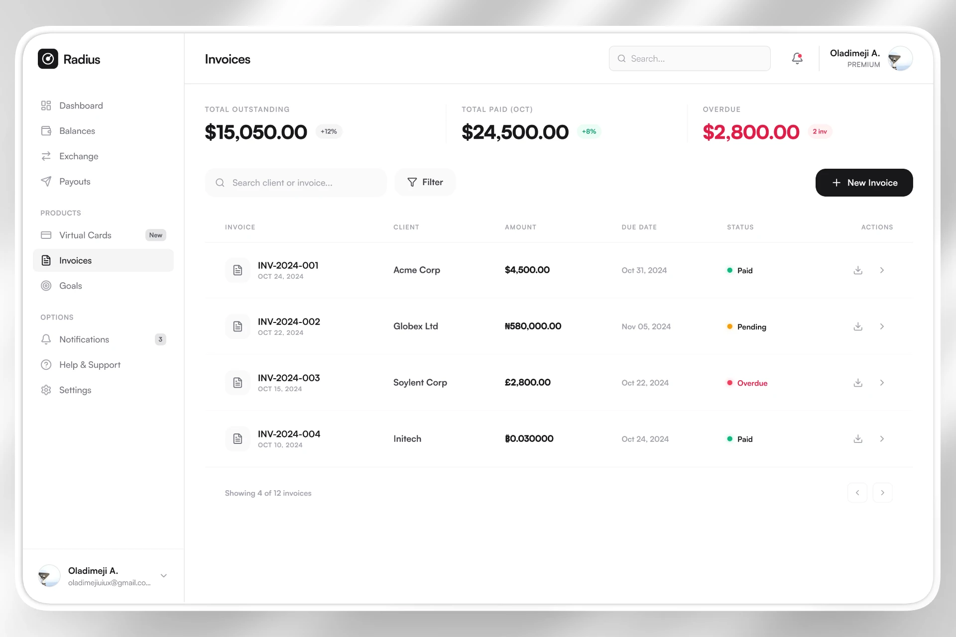
Invoicing — From Creation to Collection
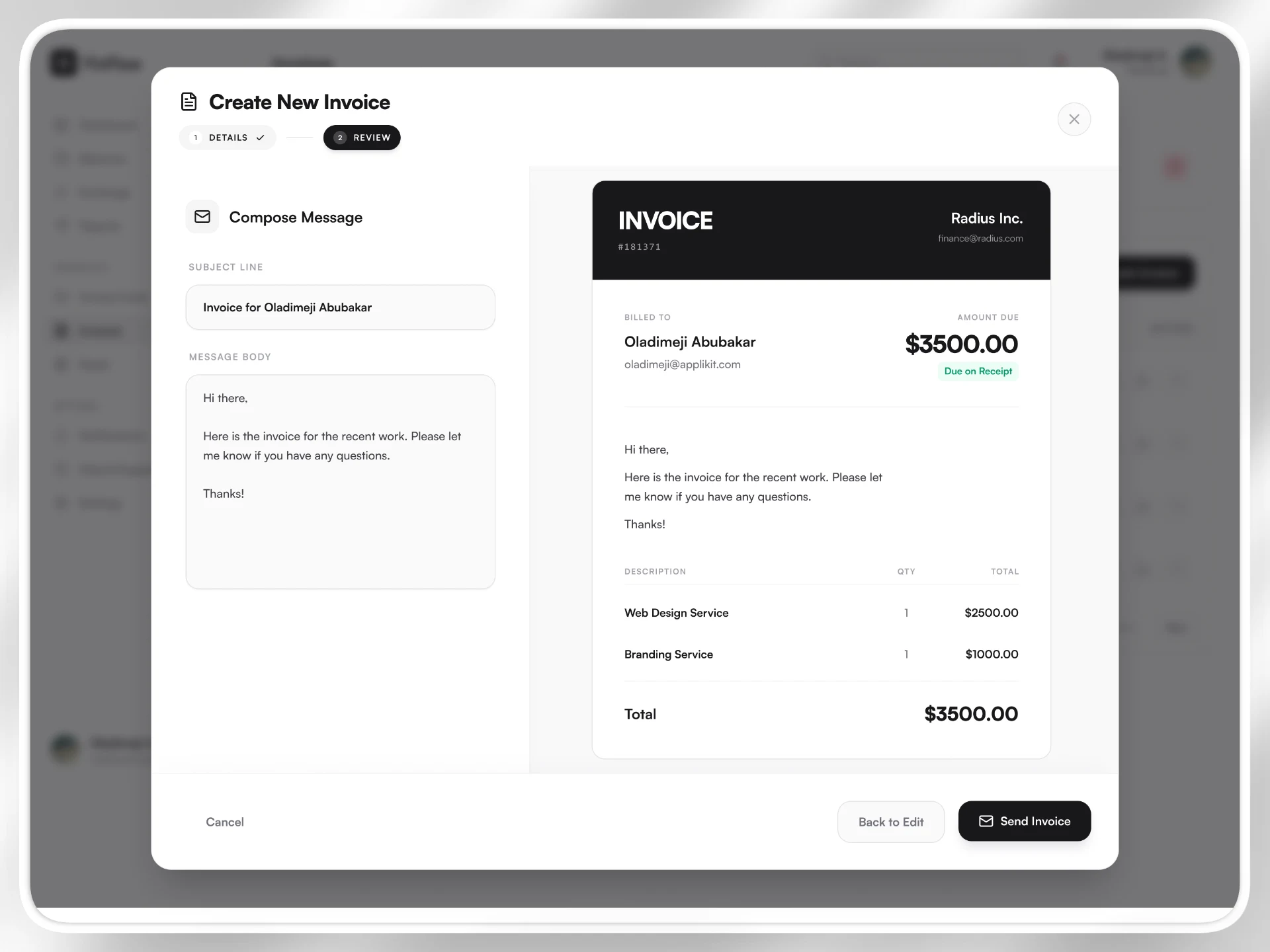
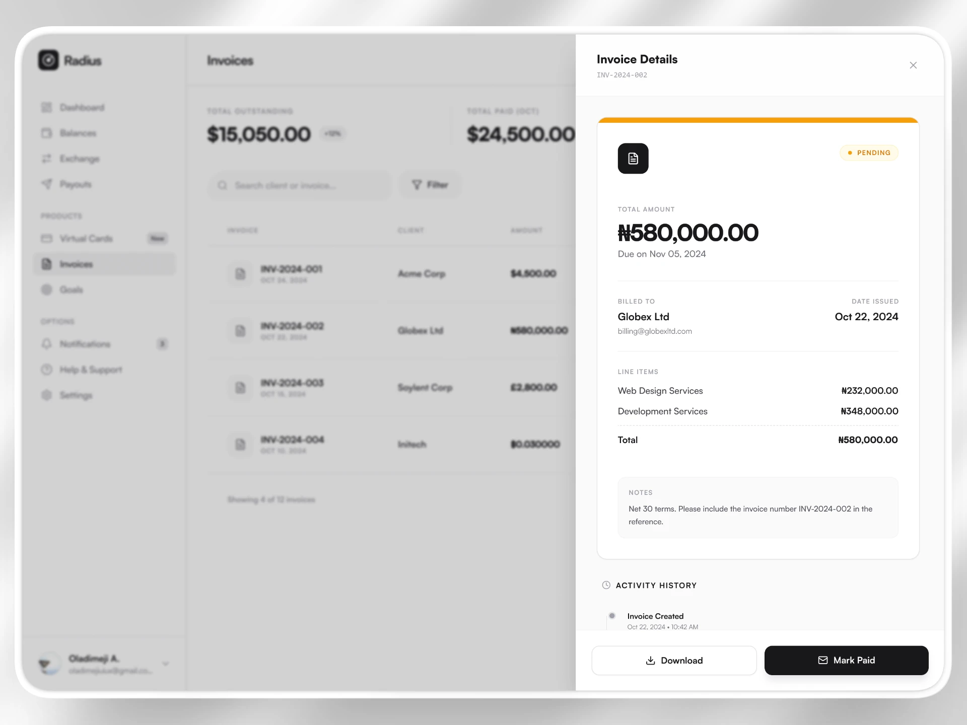
Radius extends beyond financial tracking into revenue tooling. The invoicing flow includes a multi-step creation process with a live preview rendered alongside input fields. Users can see exactly what their client will receive before sending it.
An activity timeline tracks invoice states from creation to payment, including view timestamps. This reduces uncertainty and empowers freelancers with visibility into client engagement, removing guesswork from follow-ups.
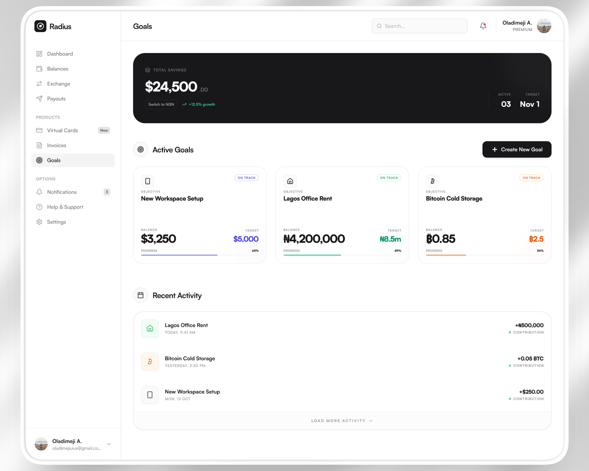
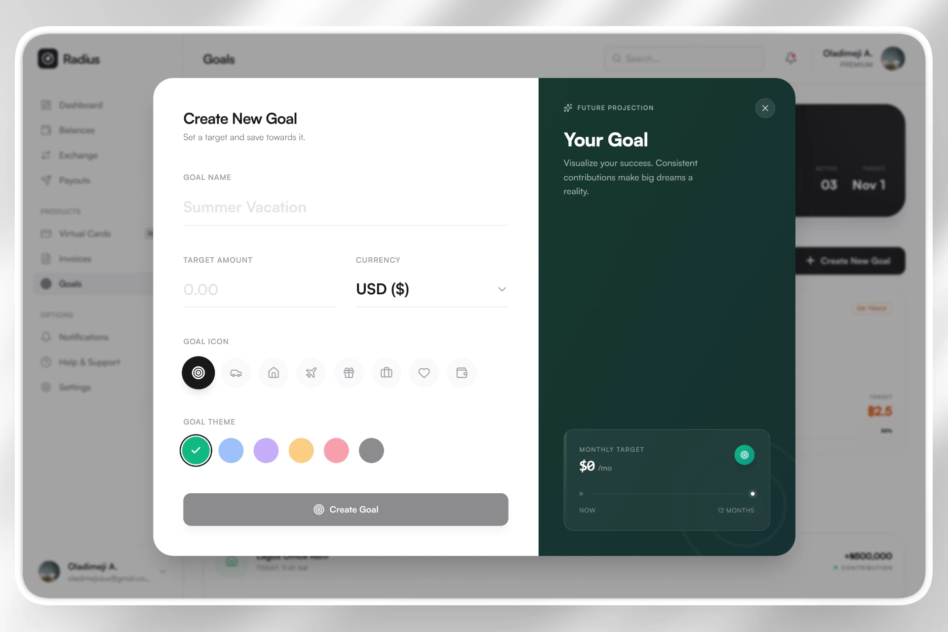
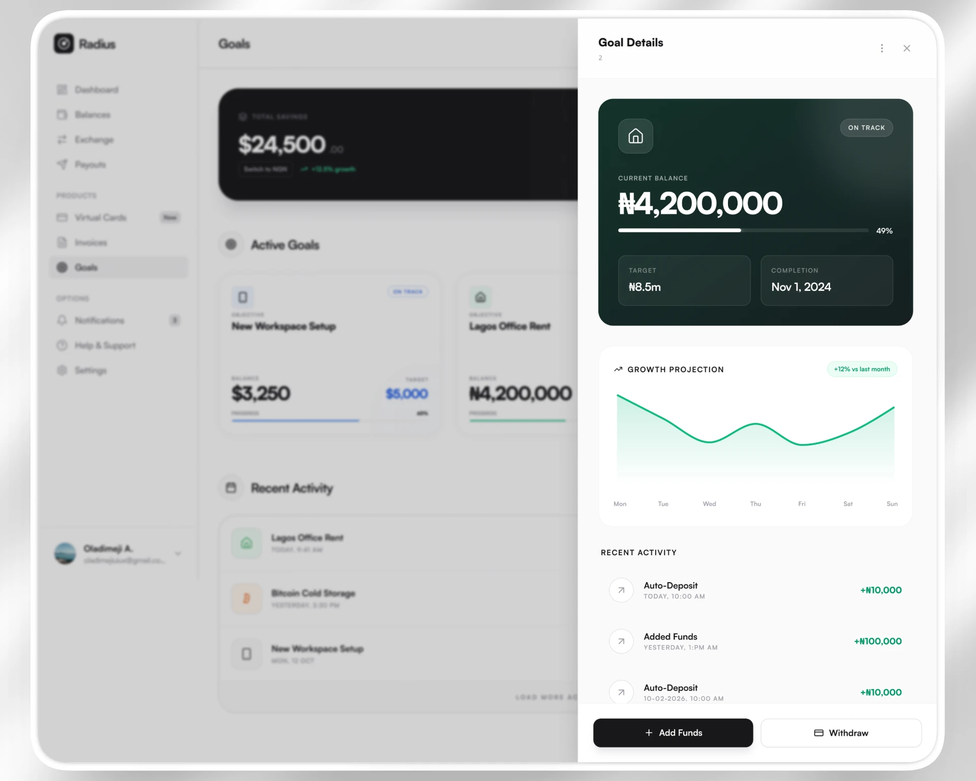
Goals — Savings That Feel Tangible
Savings are presented as progress rather than static numbers. Goal cards display visual progress bars, contextual status indicators, and native currency formatting — whether USD, NGN, or BTC. Multi-currency tracking is treated as normal rather than exceptional, reflecting the lived reality of the target user.
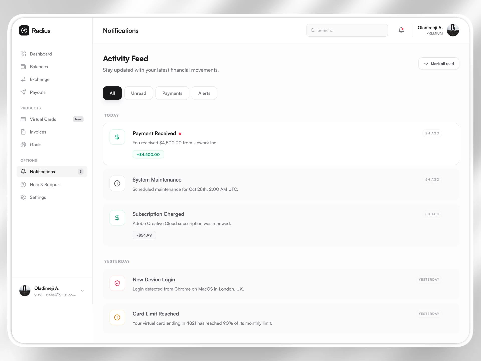
Notifications — Calm, Not Noisy
Notifications are categorized by type and grouped by time, enabling quick triage. Semantic color accents differentiate payment confirmations, security alerts, and system updates. Even the empty state is intentional, reinforcing a sense of completion rather than absence.
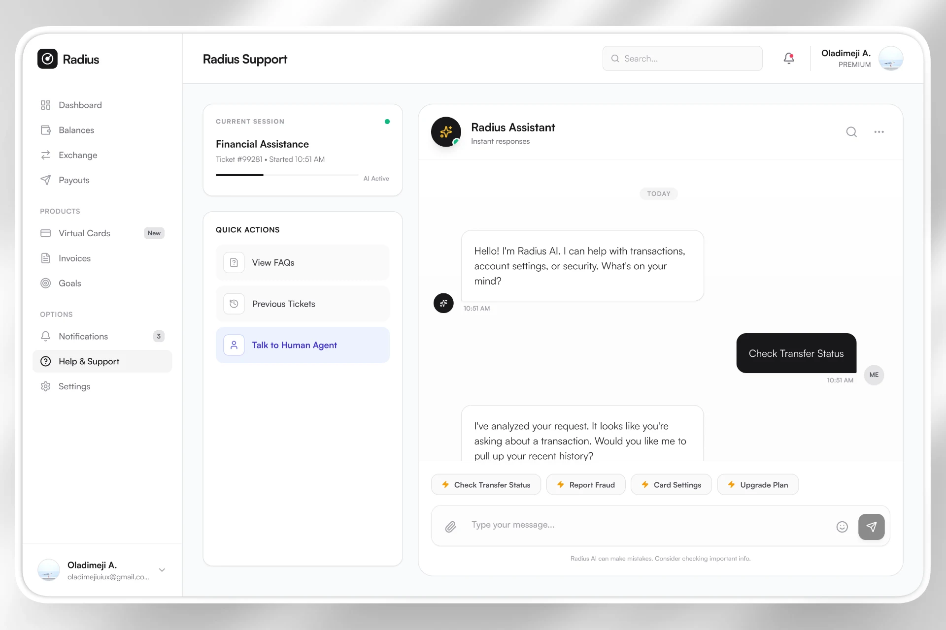
Support — AI First, Human When Needed
Support operates through an AI-first model with seamless human handoff. The transition between AI and human agents is visually distinct, ensuring users understand who they are communicating with. Honest disclaimers acknowledge AI limitations, reinforcing transparency and trust.
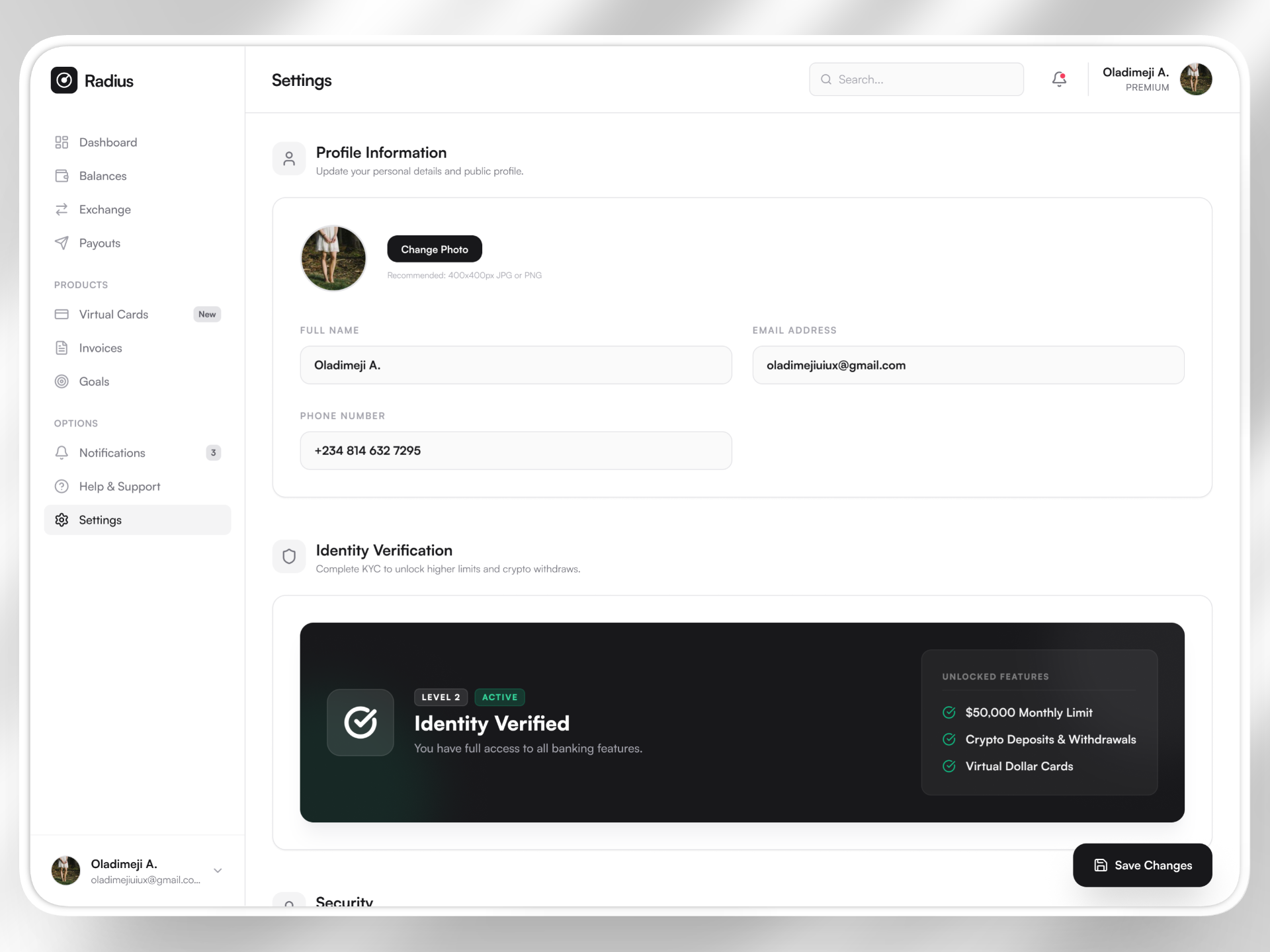
Account & Settings
Design System
Radius uses a restrained zinc-based monochromatic palette with semantic accent colors reserved for meaning. Typography relies on strong weight contrast and clear hierarchy rather than decorative typefaces. Generous spacing and rounded corners soften the interface, counterbalancing the rigidity often associated with financial products.
Motion is subtle but purposeful, providing feedback without distraction. Nothing is ornamental; every visual decision reinforces clarity, hierarchy, or confidence.
Outcome
Radius demonstrates that financial complexity does not need to feel complex. Through progressive disclosure, pattern consistency, and action proximity, the product reduces cognitive overhead while maintaining depth.
The ultimate outcome is psychological relief. Instead of switching between multiple platforms to manage income, exchange funds, track invoices, and monitor savings, users gain a single, coherent financial view that empowers decision-making within seconds.