Talo
A multi-currency wallet for Nigerians who move money between naira, USDT, and dollar spend without wanting to think about it as three separate systems.
The problem it's solving
Most Nigerians dealing with stablecoins today are stitching together three or four apps: a bank app for naira, a crypto wallet for USDT, a P2P group or exchange to convert between them, and a separate card provider (or a fixer) to actually spend dollars online. Every conversion is a context switch, and every switch is a chance to get a bad rate or send to the wrong address.
Talo's whole bet is that these aren't three products. They're one balance sheet with three faces. The job was to design that as a single mental model instead of a tab bar that just happens to have three wallets in it.
Home: one balance, not three apps
The home screen stacks the NGN and USDT wallets as physical cards you can flick through, with a single eye icon to hide both balances at once. That's a small decision with a real reason behind it: in a lot of the contexts people check a finance app (in traffic, in a meeting, on a shared screen) you don't want your balance sitting there in plain text. One toggle, not two.
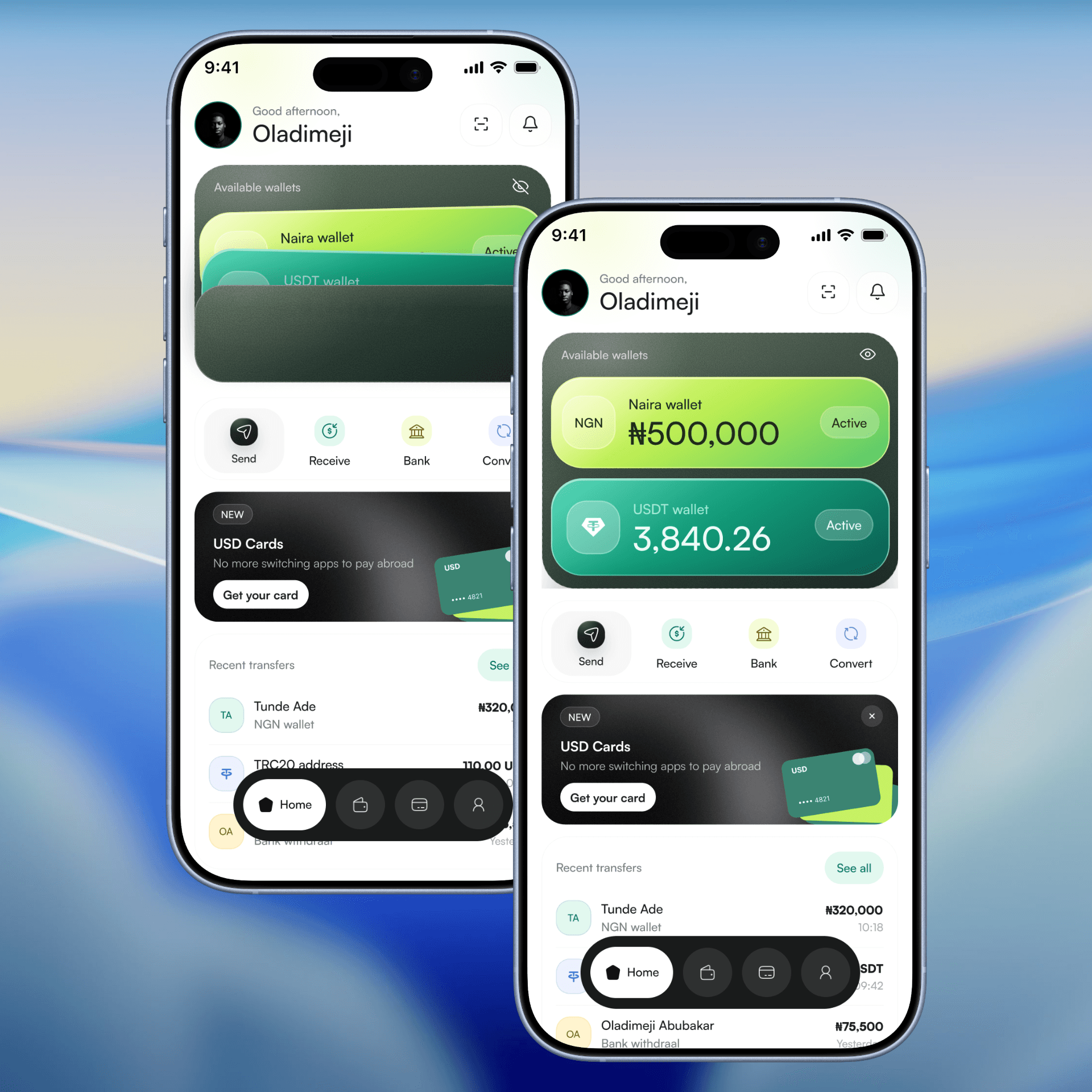
The action row underneath (Send, Receive, Bank, Convert) doesn't ask which wallet first. It reads intent, then figures out currency after. That ordering matters because most people know what they want to do before they know which wallet it's coming from.
Recent transfers on this screen deliberately blend NGN and USDT activity into one feed. Splitting them by currency would've been the "cleaner" IA decision. It would also have made the home screen lie about what actually happened in someone's account that day.
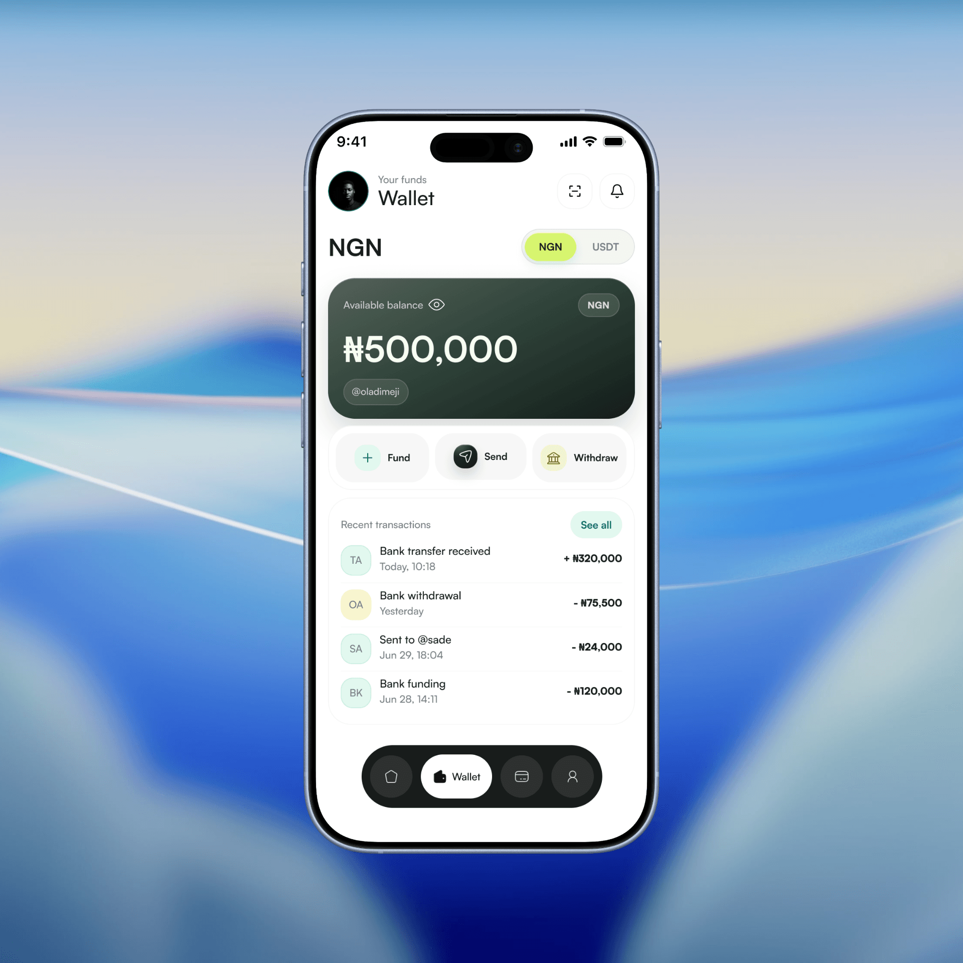
Your NGN wallet
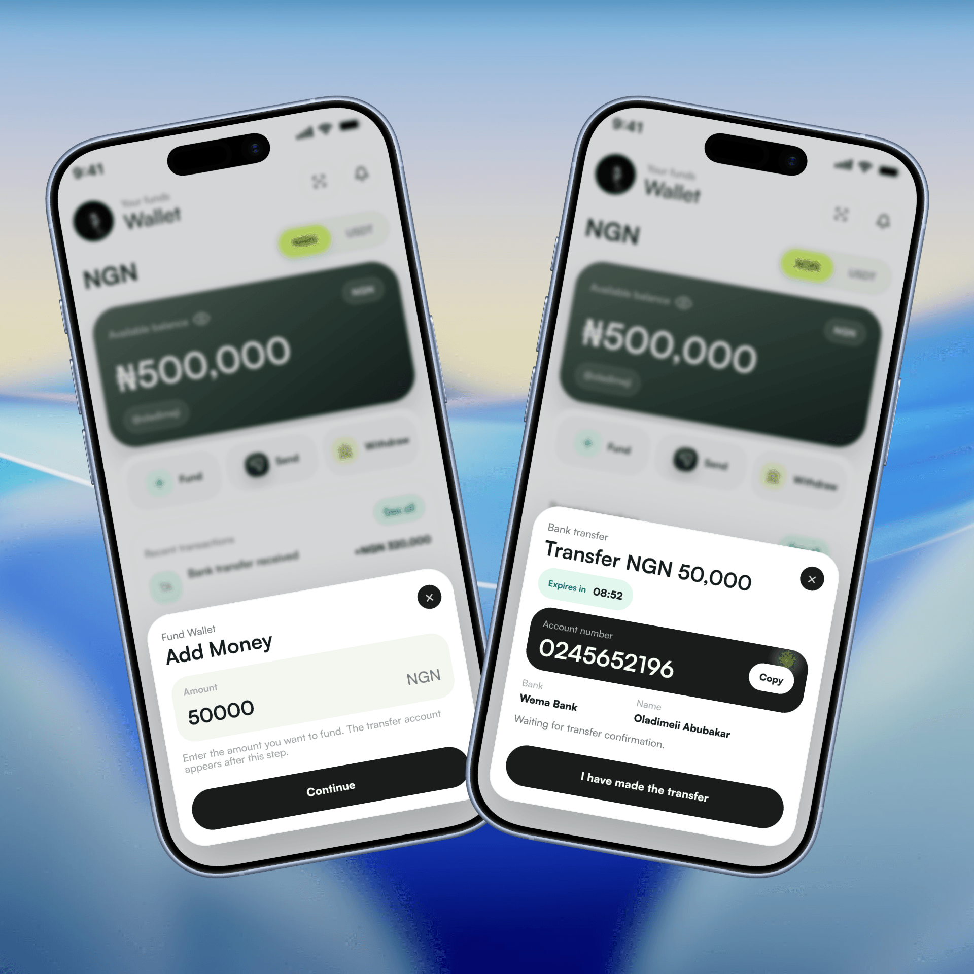
The funding flow doesn't hand you a static account number. It generates a fresh virtual account per request, tied to a specific amount, with an expiry timer. This kills two problems at once: people sending the wrong amount because they reused a stale reference, and reconciliation headaches on the backend from mismatched transfers. The countdown also does something psychological, it tells the user this is a live, single-use pipe, not a permanent account they can bookmark.
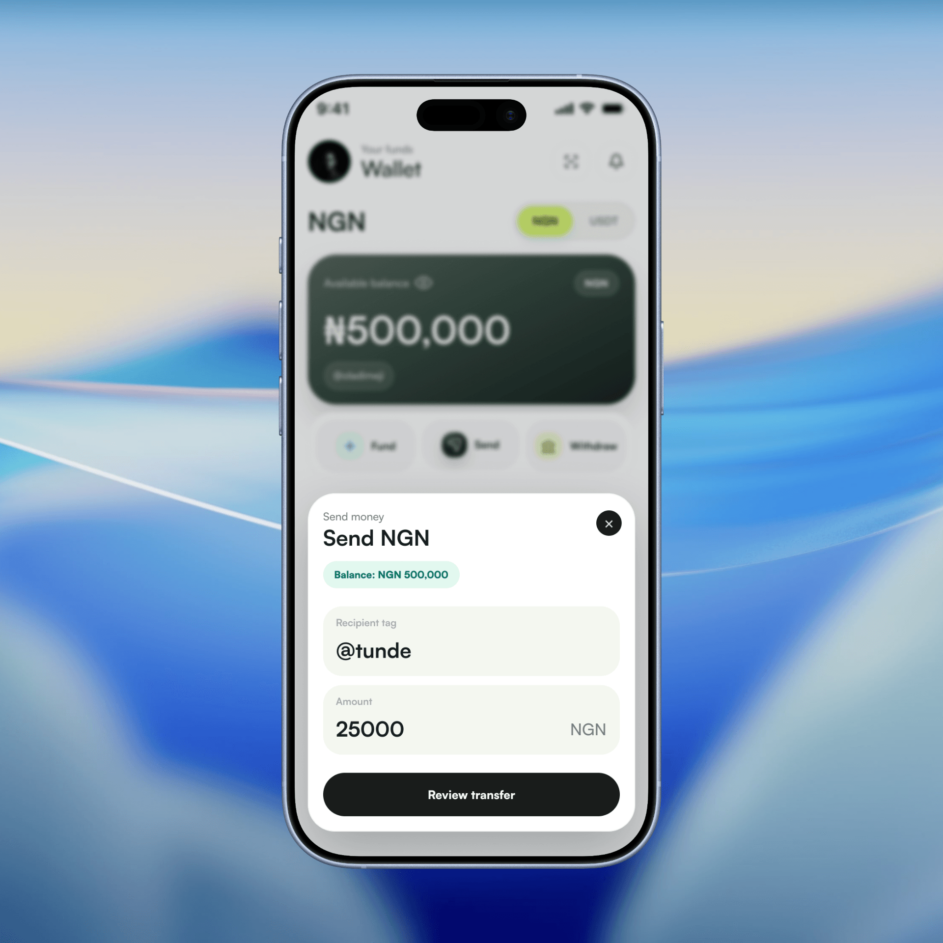
Sending naira from your wallet to another Talo user is made possible with Talo tags. Simply put, you can easily send funds to another user using their username.
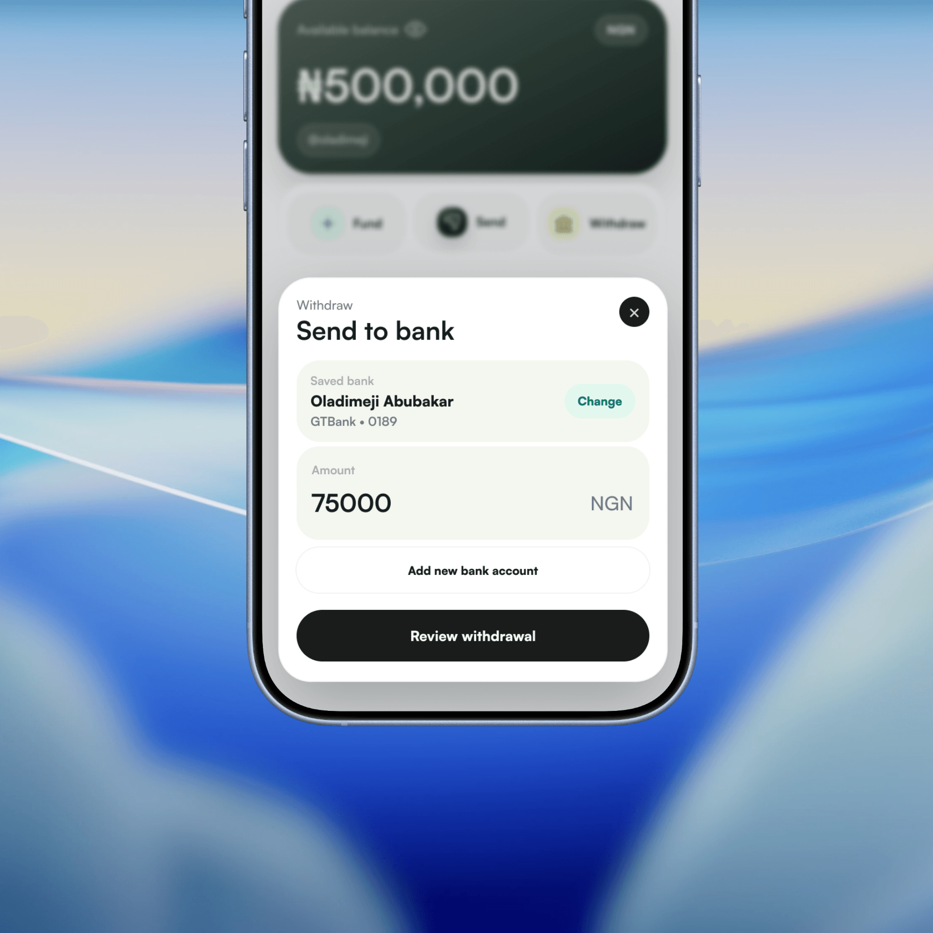
Withdrawal goes the other way and leans on a saved bank account by default, with the option to add a new one sitting one tap away rather than forced every time. Most withdrawals are repeat behavior. The flow should optimize for the ninth withdrawal, not the first.
USDT wallet: treating crypto like money, not like crypto
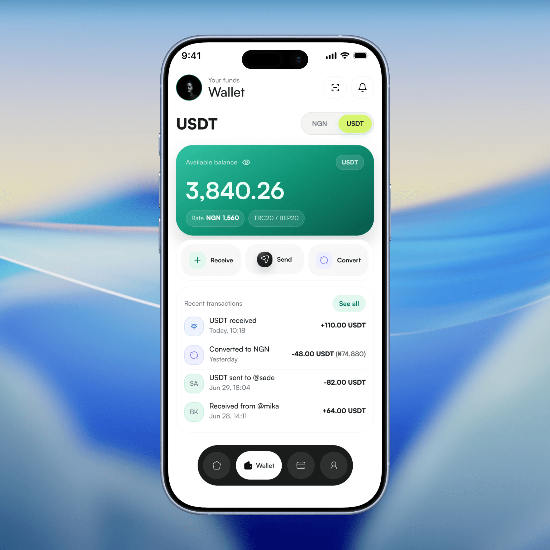
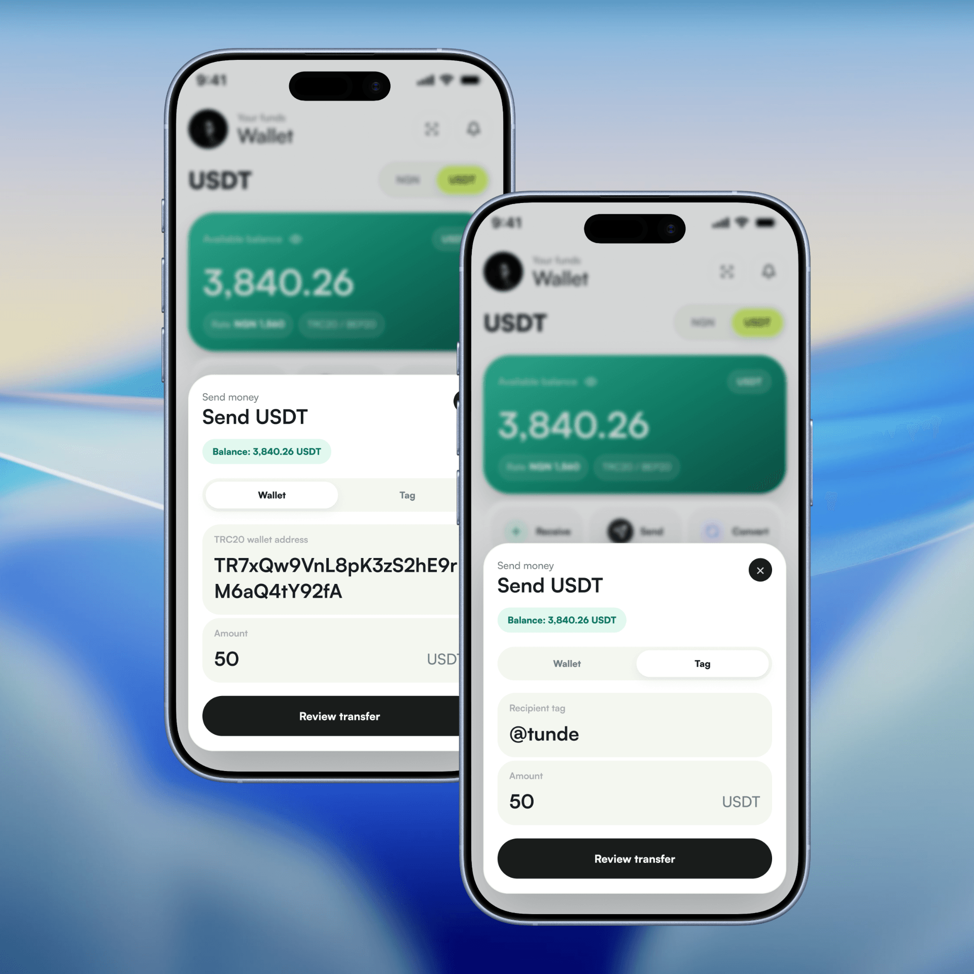
This is where the product take is most obvious. The USDT wallet doesn't isolate the technical stuff (TRC20 addresses, network types) as the only way to move funds. Sending supports both a raw wallet address and an internal @tag. That's a deliberate two-speed system: address-based transfer for anyone outside Talo, and tag-based transfer for anyone inside it, which is instant and doesn't touch the chain at all.
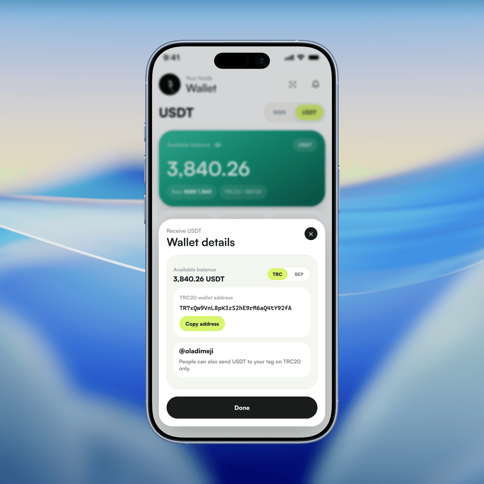
Receive works the same way, wallet address for external senders, tag for internal ones, both surfaced on the same screen instead of buried in a settings toggle. The goal was to make sending USDT feel as low-friction as sending naira to a contact, without hiding the fact that it's actually moving on TRC20 underneath.
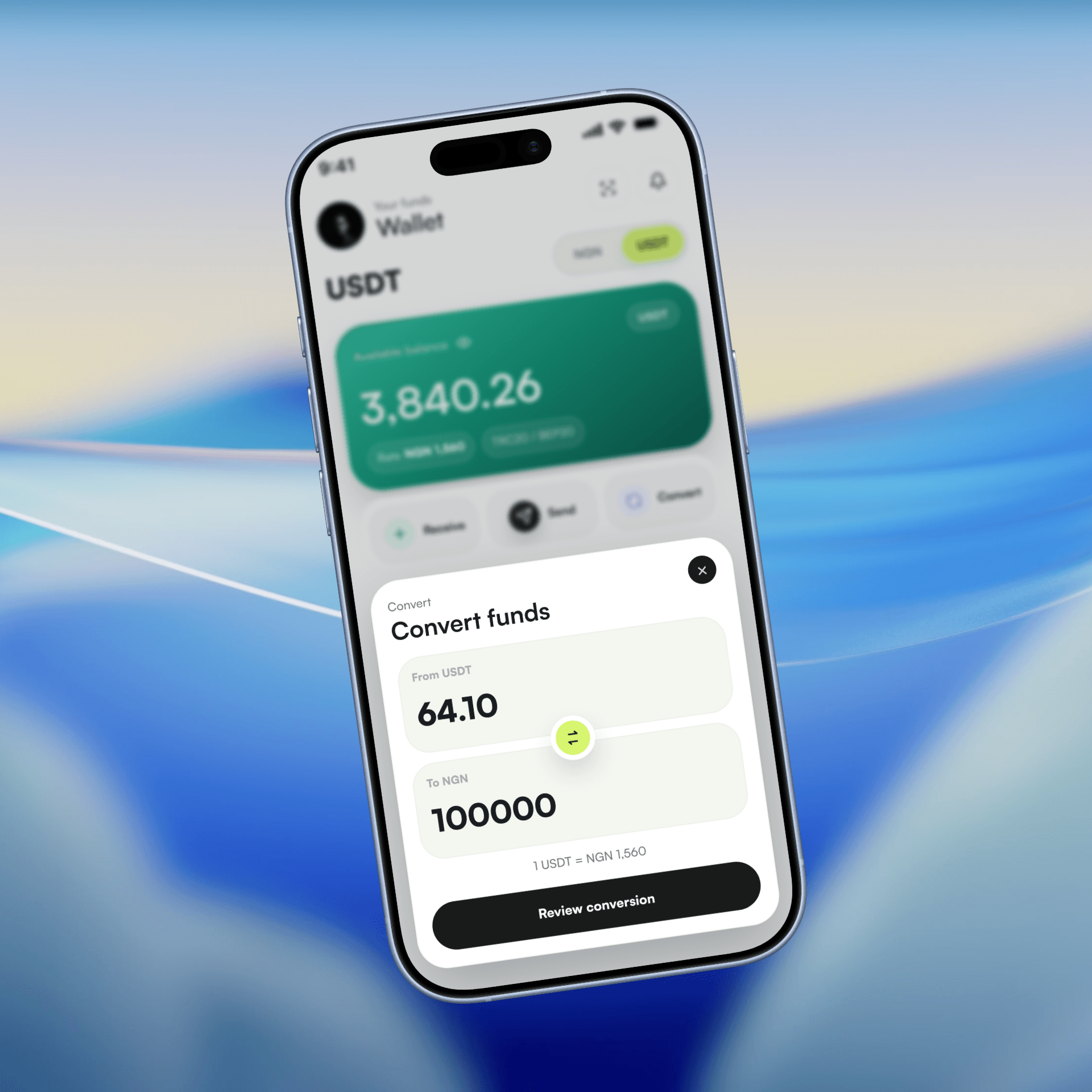
Convert lives inside the wallet itself, not as a separate "exchange" section. Rate is shown live before you commit, right on the balance card and again in the convert sheet. No jumping to check a rate somewhere else, coming back, and hoping it hasn't moved.
USD card: the international spend layer
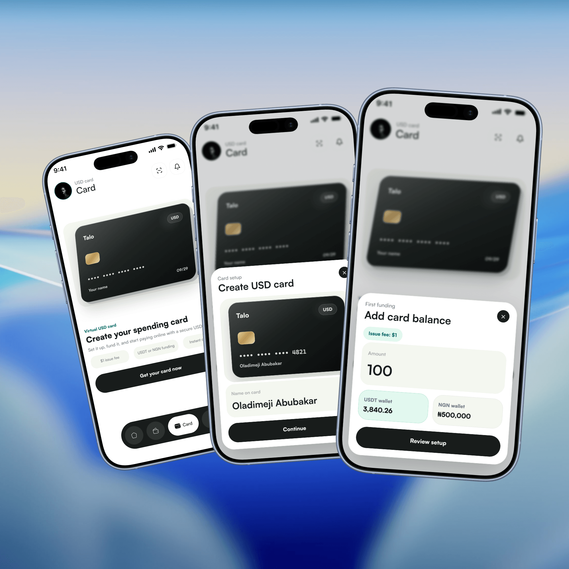
The card is framed as an add-on, not a fourth wallet. It only shows up meaningfully once you've got balance to fund it with, and it can be funded from either NGN or USDT at the point of creation. That's intentional: the card isn't a separate product with its own onboarding, it's a spending mode for money you already have.
Creating the card is broken into distinct, small steps: name the card, set an initial amount, review the fee and daily limit, confirm. Each one is a separate sheet rather than one long form. For anything involving an actual balance commitment, breaking it into stages that can be reviewed and backed out of matters more than saving the user a few taps.
Once live, the card view separates the everyday actions (fund, freeze, move) from the sensitive stuff. Full card number, CVV, and billing address sit behind a "Secure view" step rather than being visible by default on the main card. That's not decoration, that's the difference between a screen you can glance at on a bus and one that exposes your CVV to whoever's next to you.
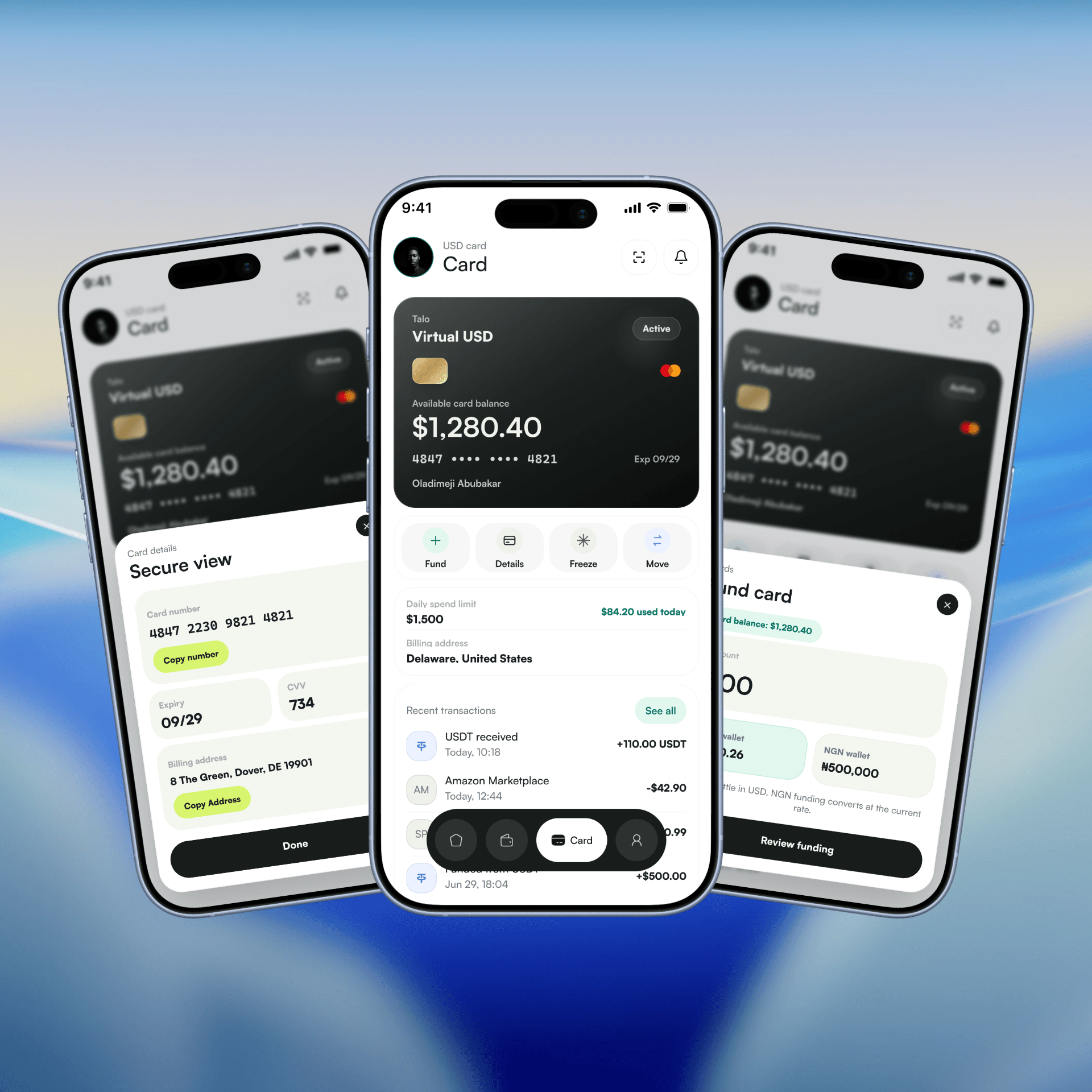
Daily spend limit and usage are shown as a running number against the limit, not just a static cap. Small thing, but it turns the card from a static object into something the user is actively managing.
Identity: the tag as the connective tissue
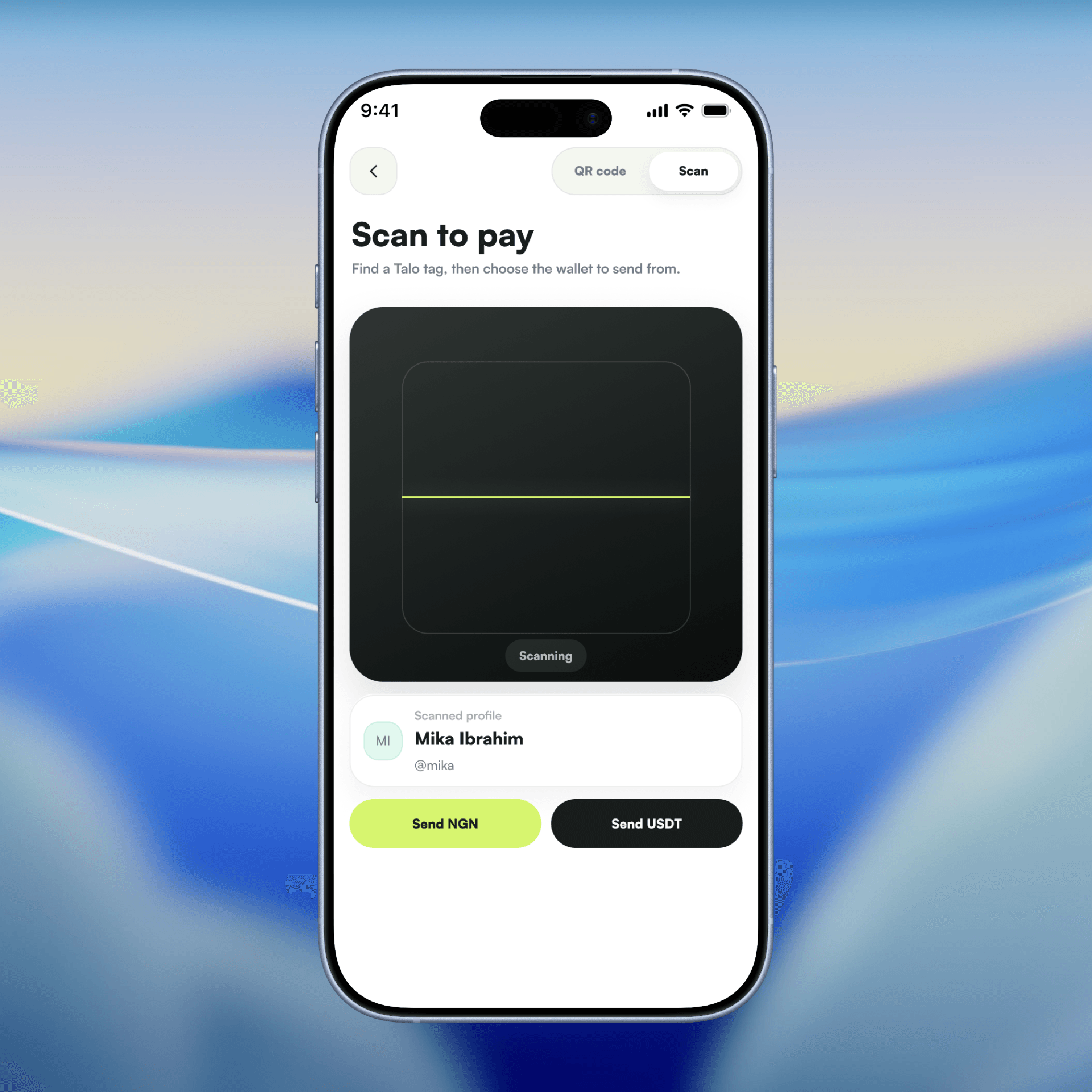
Every wallet, every send flow, every receive sheet eventually points back to one thing: the Talo tag. The QR screen makes this explicit by labelling the tag "NGN + USDT" instead of generating a separate code per currency. One identity, two settlement rails behind it. That's the same instinct as the home screen, just pushed down into identity instead of balance.
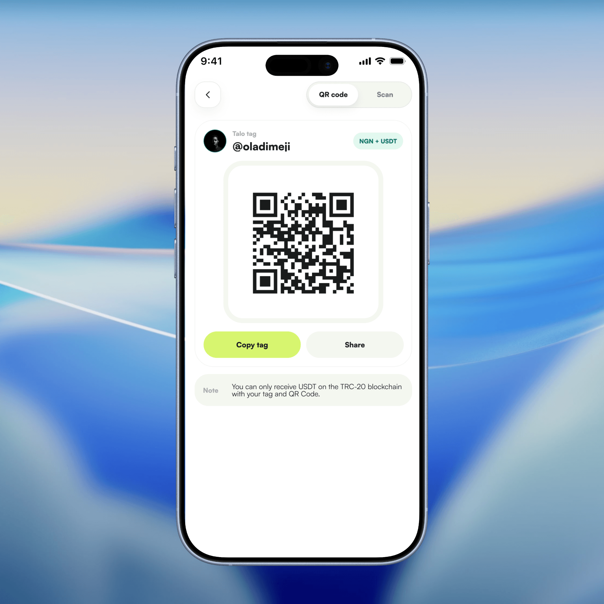
Scan flips the same idea around. Once a profile is detected, the user isn't asked to pick a wallet first, they're given a straight choice: Send NGN or Send USDT. The currency decision happens at the last possible moment, after the "who," not before it. That ordering is consistent with how Send works everywhere else in the app.
Notifications
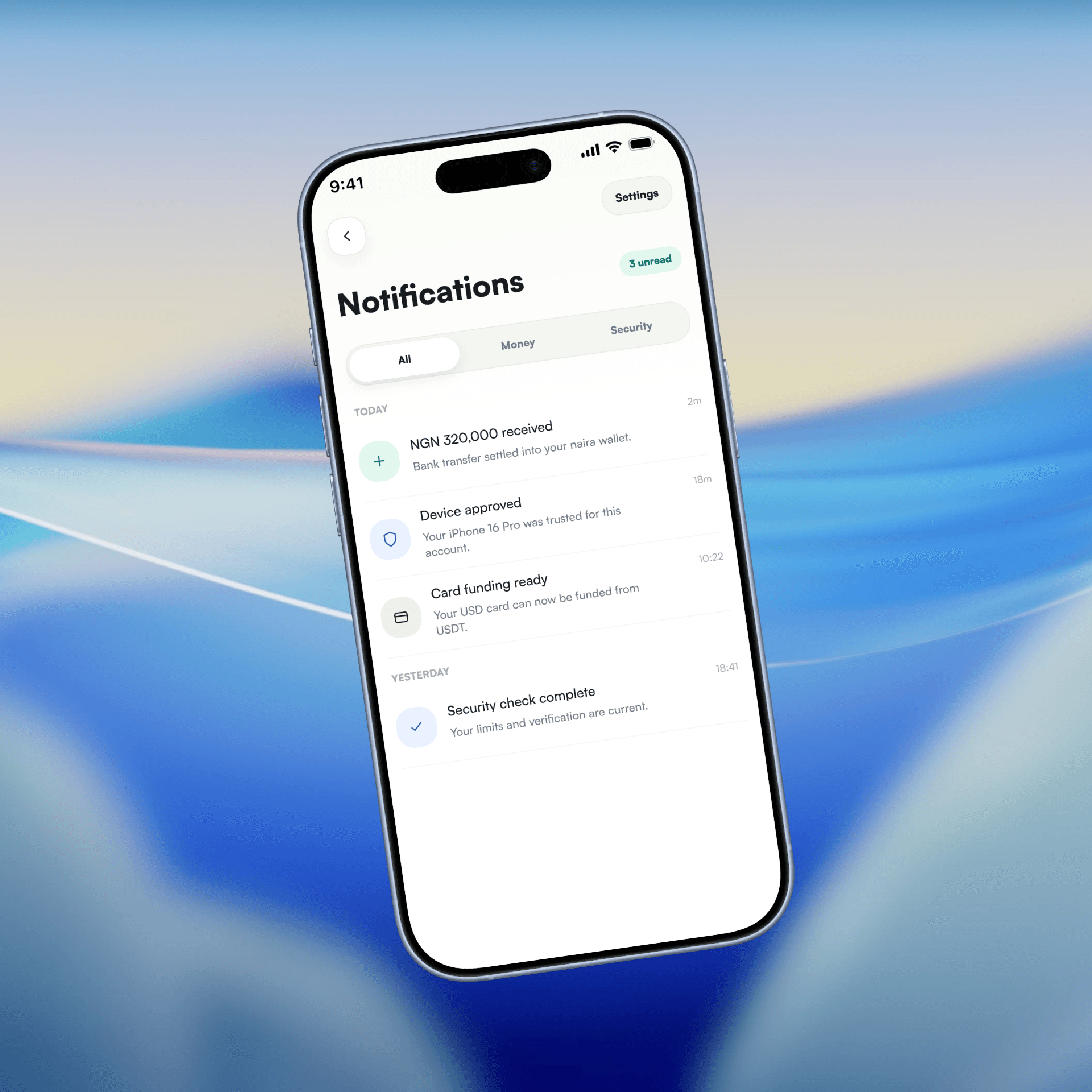
Notifications feature a grouped clean interface that makes it easy to check money-related alerts and also security alerts.
Account
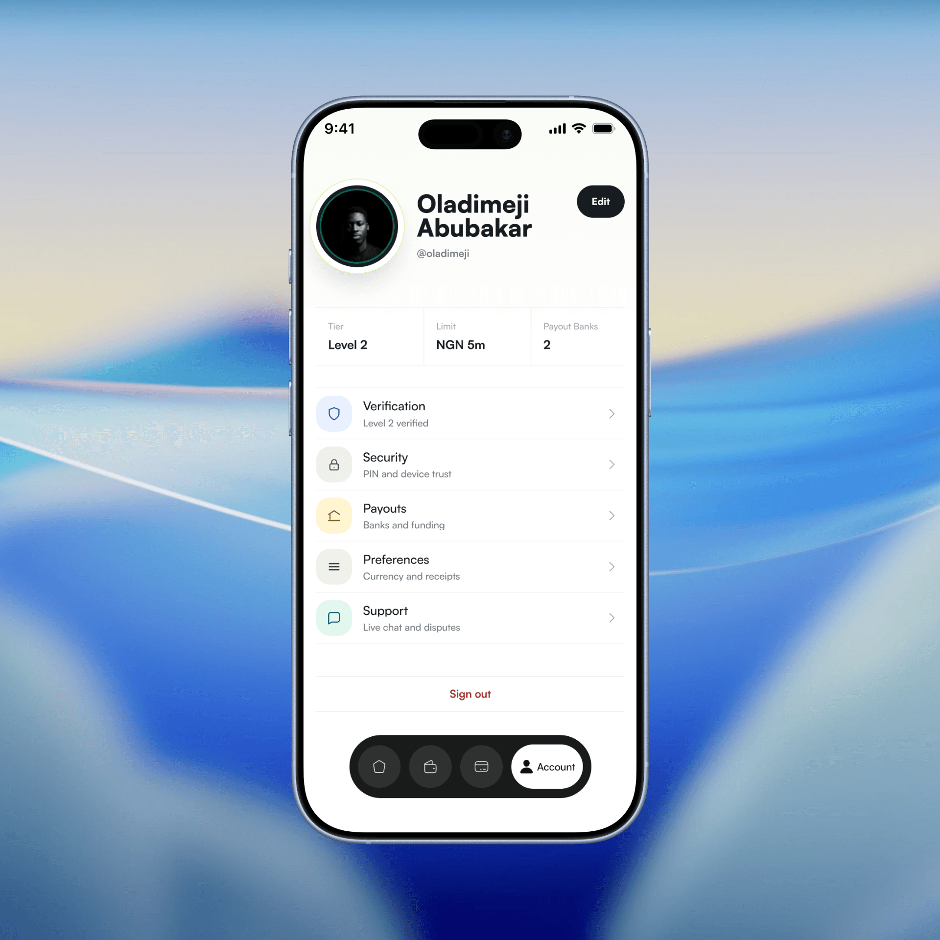
The profile screen puts trust signals where the user actually looks first, not buried under settings. Tier, transaction limit, and number of payout banks sit directly under the name, before verification or security even get a row. That ordering is a quiet statement: your standing in the system is information, not an afterthought you dig for.
What this demonstrates
None of these screens were hard to lay out. Naira card, USDT card, dollar card, the components repeat themselves. The hard part was deciding which parts of the experience get to feel identical across the three currencies and which parts have to feel different on purpose.
Fund, send, review, confirm, that pattern stays the same everywhere because switching it up per currency would've made the app feel like three products wearing the same skin. Everything past that shared structure is where the real decisions happened, and most of them don't show up as a screen, they show up as the screen you didn't have to build.